
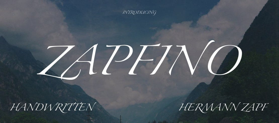

About Zapfino Font
I ran into Zapfino Font while working on an invitation set for a small wedding brand. I needed something dramatic, flowing, and a bit theatrical, but still readable in print. Most script options felt either too casual or too stiff, so I spent time testing a lot of different typefaces.
Zapfino stood out right away because of its sweeping curves and extreme contrast. It looked less like simple handwriting and more like careful calligraphy done with a pointed pen. I decided to test it further and write about it for Free Fonts Lab, mainly to see where this font shines and where it becomes tricky in real work.
Font Style & Design Analysis
Zapfino Font is a handwritten typeface, but it sits at the very elegant, calligraphic end of that category. The strokes are high contrast, with very thin hairlines and bold swells in the curves. Many letters include long, decorative flourishes that stretch above and below the main line of text.
The design comes from Hermann Zapf, a well-known calligrapher and type designer. You can feel that deep calligraphy background in every curve and join. This is not a casual note-taking script; it is a highly stylised showpiece. The font family often ships with operating systems, which is why many designers stumble upon it early.
The letterforms have strong rhythm, with a clear slant and flowing connections between characters. Spacing is fairly open, but the long swashes can cause visual clashes when letters sit too close. The mood is romantic, formal, and a bit dramatic. It excels in expressive typography, but it struggles in tight layouts or dense paragraphs where ornaments start to fight the content.
Where Can You Use Zapfino Font?
From my tests, Zapfino Font works best at larger sizes, where the fine details and loops have room to breathe. On wedding invitations, event titles, or luxury packaging, it can create a strong first impression. It suits audiences that expect elegance, ceremony, and a sense of tradition rather than minimal, modern design.
For small sizes, like body text or footnotes, the thin strokes and complex shapes become hard to read. The handwritten style also makes long passages feel tiring. I usually limit it to short phrases, names, or single lines. For the rest of the layout, I pair it with a clean serif or sans-serif font family to keep the visual identity balanced and practical.
It also works nicely for logos in beauty, perfume, boutique fashion, or high-end stationery brands, as long as the name is short. When the wordmark gets too long, the swashes start to collide and hurt legibility. Used carefully as a handwritten accent in headings or pull quotes, it adds personality without overwhelming the whole design system.
Font License
The licence for Zapfino Font can vary depending on how and where you get it. Some systems include it by default, but that does not guarantee broad commercial rights. Before using it for client work, branding, or products, I always check the official source or foundry for clear licence terms and allowed usage.
For me, Zapfino is a specialised tool, not an everyday choice. When I need dramatic, calligraphic impact for short text, it earns a spot in my toolkit. Used with restraint and good pairing, it can still feel graceful and timeless.


Leave a Reply