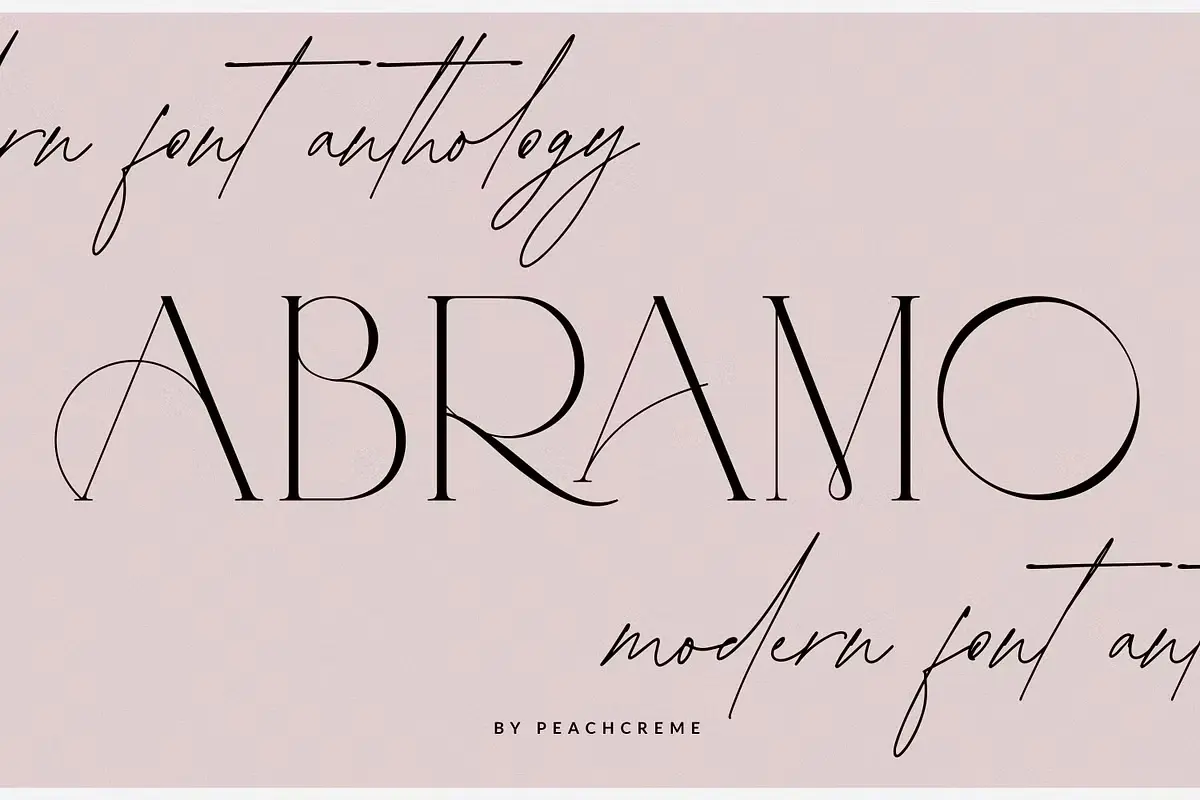
About Abramo Font
My first reaction to Abramo Font was simple: this thing wants attention. The bold, chunky shapes feel strong and loud, like a headline on a poster shouting from across the street. I was drawn to it because I needed a display typeface that could hold its own in a busy layout.
I tested Abramo Font on a set of music event covers and some rough brand sketches for a streetwear project for a Free Fonts Lab article. It seemed perfect for big, quick-impact titles where clarity and attitude both matter. That mix of power and simplicity made me curious to see how far I could push it.
Font Style & Design Analysis
From what I see, Abramo Font sits firmly in the display category. The forms are wide, heavy, and built for posters and headlines, not quiet reading. It carries a slightly retro, blocky flavour, which gives it a strong visual identity on bold backgrounds and high-contrast colour schemes.
The exact designer is unknown to me, and there is not much clear information around its origin. That said, the work feels considered rather than random. The shapes suggest someone who understands how display typography needs to perform at a distance, even if the project details stay in the dark.
Looking closer, the letterforms have tight counters and sturdy strokes, with a consistent rhythm across the whole font family. The spacing feels compact, which helps create dense, powerful word shapes at large sizes. It sets a confident, almost brutal mood, but this same weight makes it less suitable for long text or fine print work.
Where Can You Use Abramo Font?
In real projects, Abramo Font works best when you treat it like a headline specialist. I had good results using it on gig posters, event banners, and bold social media graphics. It shines when the text is short, the message is direct, and the background design does not fight for attention.
At large sizes, the heavy display style reads clean and strong, even from a distance. At smaller sizes, though, the tight shapes and thick strokes start to blend together, especially on screens. For captions or body copy, I paired it with a calm sans-serif typeface, which kept layouts readable while the main title stayed loud.
For branding, I would reach for Abramo Font when working with youth-focused or street-inspired visual identity projects. It suits sports logos, streetwear labels, and bold packaging that needs punch more than polish. When you balance it with plenty of white space and a lighter supporting font style, it can anchor a very striking and modern design system.
Font License
From what I can tell, Abramo Font may have different licence terms depending on where you get it. Personal use is often less strict, but commercial projects can be another story. I always suggest checking the official licence from the source before using it in client work or paid designs, just to stay safe.
My honest takeaway as Ayan Farabi: Abramo Font is not a gentle tool, but when a project needs bold display typography with strong impact, it can do the job well. I reach for it when I want words to feel like shapes on a poster, not just lines of text.


Leave a Reply