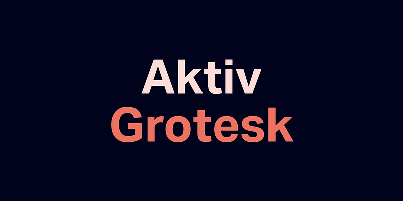
About Aktiv Grotesk Font
I first tried the Aktiv Grotesk Font on a digital product for a tech client. They wanted clean text that felt modern, but not cold or trendy. I needed a typeface that could handle both tight UI labels and longer copy without looking tired.
As I tested it, the font felt steady and grown-up. Nothing flashy, but very dependable. That quiet confidence drew me in. I later wrote about it for Free Fonts Lab, because it solved a real problem for me: keeping a clear voice across many sizes and layouts.
Font Style & Design Analysis
This is a sans-serif font family with a very controlled, neutral look. The shapes feel rational and balanced, with straight lines and gentle curves. It sits somewhere between strict Swiss modernism and softer corporate fonts. On screen, the overall colour of text looks even, with no letters jumping out awkwardly.
The font comes from the foundry Dalton Maag, who are known for solid, workhorse typefaces. You can feel that experience here. The family has many weights, which makes it easier to build a full typography system. The design choices feel careful rather than experimental, and that is part of its strength.
The letterforms are open and airy, with wide counters and simple terminals. Spacing feels slightly tight by default, which works well for interfaces and headlines. In longer text, I sometimes add a little tracking to let it breathe. The rhythm of text feels calm, almost invisible. That is great for function, but less ideal if you want a strong, expressive voice from your sans-serif font.
Where Can You Use Aktiv Grotesk Font?
I find this font most useful in digital products, corporate sites, and tech branding. It handles UI labels, navigation, and dashboards very well. At large sizes, headings look sharp and serious, without shouting. At smaller sizes, the open shapes stay readable, especially on high-resolution screens.
For brand work, it suits companies that want to appear modern, precise, and reliable. Think software tools, finance platforms, logistics, or clean product packaging. It pairs nicely with a warm serif for editorial sections, or with a bold display font for campaign headlines. I often use a lighter weight for body text and a medium or bold for titles.
In print, it works nicely for brochures, manuals, infographics, and wayfinding systems. Very long reading, like novels, is not its sweet spot, but reports and presentations feel clear and organised. If you design grids with good spacing, the font locks in neatly and keeps layouts tidy. It works best when the design goal is clarity first, personality second.
Font License
Licensing for the Aktiv Grotesk Font can vary by source and usage type. Always check the official provider for details on desktop, web, and app rights. Do not assume that personal use covers client or commercial projects. I always review the licence terms carefully before including it in paid work.
For me, this font is a dependable tool rather than a showpiece. When I need calm, precise typography that does not distract from the content, Aktiv Grotesk quietly does its job.


Leave a Reply