About Albert Sans Font
I first tried Albert Sans Font while working on a clean interface for a small web app. I needed something modern, calm, and readable, without feeling cold or too corporate. The name kept popping up in my research, so I decided to give it a proper test across headings, body text, and UI labels.
The more I used it, the more I noticed its quiet confidence. It does not shout for attention, but it holds a layout together very well. For Free Fonts Lab, I also set some mock landing pages with it, just to see how it behaved in longer copy and simple branding systems.
Font Style & Design Analysis
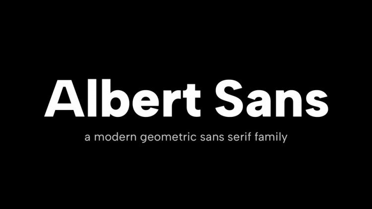
Albert Sans Font is a sans-serif typeface with a clean, contemporary voice. Strokes feel even and balanced, and the shapes lean towards geometric forms without looking stiff. The overall impression is neat and open, with enough warmth to make digital interfaces feel friendly rather than overly technical.
From what I could find in my research, the font is part of a well-structured font family with multiple weights. I could not confidently trace one single designer, so I will simply note the designer as unknown here. What mattered more in practice was how consistent each weight felt across a full system.
The letterforms show clear, simple construction. The lowercase has generous counters, which helps readability in paragraphs. Spacing feels slightly loose by default, which works nicely on screens and can be tightened for print. The rhythm stays steady, so text blocks look even. Its typography strength lies in clarity, though it lacks strong personality for very expressive branding. As a sans-serif foundation, it performs best when you want function first.
Where Can You Use Albert Sans Font?
I found Albert Sans Font very dependable for user interfaces, dashboards, and simple websites. At larger sizes, headings look tidy and modern, especially in the bolder weights. For smaller labels, menus, and buttons, the open shapes hold up well and stay legible, even on lower‑resolution screens.
For long paragraphs, it works well if you give it enough line spacing. I used it in product descriptions and short articles, and the reading comfort was solid. For more characterful projects, I paired it with a serif display typeface for titles. That mix helped balance neutral body text with a more distinctive headline font style.
Branding-wise, it suits tech startups, education platforms, health apps, and any visual identity that values clarity and trust. It may feel too quiet for edgy fashion or artsy posters on its own, but you can combine it with a strong display typeface for contrast. As a base typeface in a system, it gives you structure without getting in the way.
Font License
Licensing for Albert Sans Font can change over time, and different sources may offer different terms. Before using it in client work or commercial projects, always read the official licence details carefully. For personal experiments or mockups, still double-check the current usage rules from the original provider.
My honest takeaway as Ayan Farabi: this is a reliable, neutral workhorse that fits smoothly into many layouts. I reach for it when I want order, clarity, and a calm tone, especially in digital products where text must stay clear at many sizes.


Leave a Reply