

About Alexis Font
I came across Alexis Font while searching for a bold headline style for a poster series. I needed something loud but still readable, and nothing too fancy or nostalgic. The shapes caught my eye first, so I decided to test it properly on a real layout.
For that poster project, I tried a few other options, but this one held up better in tight spaces. The letters felt confident without shouting too much. I later wrote some notes about it for Free Fonts Lab, because it behaved differently from many display fonts I usually use.
Font Style & Design Analysis
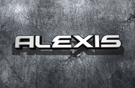
Alexis Font is a pure display typeface, and it shows that clearly in its size-driven personality. The shapes feel built for impact, with strong forms that grab the eye. Strokes sit on the heavier side, and the overall texture leans modern rather than retro or playful.
The designer is listed as designer unknown, which makes it harder to track intent, but some choices still feel quite deliberate. There is a sense of controlled energy in the font family, like it wants to stand out but stay usable. That balance is rare in many display fonts I test.
The letterforms are compact, with tight counters and a rhythm that pulls words into solid blocks. Spacing is slightly condensed, which works well for short headlines, but long lines can feel dense. The mood sits between assertive and neutral, so it suits clear, direct messages. Its main strength is impact, while subtle, quiet layouts are not its best use.
Where Can You Use Alexis Font?
I found Alexis Font most comfortable in large sizes, where the display character can breathe. Posters, banner headlines, hero images, and strong social media cards are good fits. It handles bold statements, sale messages, event names, or campaign slogans without losing clarity.
At smaller sizes, the tight spacing and heavy shapes start to merge, especially on low-resolution screens. I would not use it for long paragraphs, UI labels, or fine print. Paired with a clean sans-serif body font, it can anchor a layout nicely and give a clear visual hierarchy.
The font also works in branding when a project needs a firm, modern wordmark that feels simple yet striking. I can see it on tech, sports, streetwear, or music graphics. When I pair it, I like to keep the supporting typography lighter and more open, so the display weight of this font remains the clear focus.
Font License
The licence terms for Alexis Font can change, and different sources may offer different permissions. Before using it in client work or commercial projects, I always check the official licence details carefully. For personal experiments or tests, I still keep a copy of those terms nearby.
My honest view: it is a solid display option when you want firm, compact headlines and do not need soft or delicate moods. Used with space and a lighter companion font, it can bring strong structure to a layout without feeling cheap or gimmicky.


Leave a Reply