
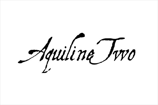

About Aquiline Font
I came across Aquiline Font while searching for a script style for a wedding invite set. I needed something elegant, but not too fancy or hard to read. The font had a soft, flowing look that felt romantic without being cheesy, so I decided to test it in a full layout.
I first dropped it into heading lines and name details, then tried it on menus and place cards. On Free Fonts Lab, I often see script fonts that look pretty in samples but fail in real projects. This one made me pause, because the strokes looked controlled and clear even at medium sizes, so it felt worth a deeper review.
Font Style & Design Analysis
This typeface is a script font, and it aims for a classic, handwritten look with a formal twist. The letters connect smoothly, but the shapes stay quite disciplined, almost like careful pen calligraphy. It sits between romantic and reserved, giving the text a gentle flow without wild curls or messy strokes.
The designer is designer unknown, which makes it a bit harder to place in a specific design tradition. Still, the drawing quality feels deliberate, not rushed. The curves keep a steady thickness, and the joins show someone thought about real pen movement. It does not feel like a random brush experiment or an auto-traced script.
Looking closely at the letterforms, the lowercase set carries most of the charm. The loops are narrow, and the ascenders stay fairly tall, which adds grace but can make lines feel tight. Spacing leans close, so long words can look dense if you do not add tracking. The rhythm works best in short names, headings, and tags. For long paragraphs, the flowing shapes start to tire the eye, so it is not great for body text. Its main strength is mood: poised, slightly formal, and quietly romantic. The limitation sits in flexibility; it demands careful layout and enough breathing room.
Where Can You Use Aquiline Font?
In my tests, this script font worked best in projects that needed a personal yet refined voice. Wedding invitations, save-the-date cards, event titles, and boutique packaging all suited it well. Large sizes bring out the curves and make the strokes feel smooth. At big scale, the swashes look intentional, not overly dramatic.
At smaller sizes, like under 12pt in print or small captions on screen, the thin joins start to blur. I would not set long quotes or paragraphs in this font. Instead, I paired it with a clean serif or sans-serif for body copy and used Aquiline Font only for names, key phrases, or short headings. That balance kept the layout readable while still giving a rich typographic accent.
I also tried it in branding work for a small beauty label and a florist. It added a gentle, trustworthy feel, especially when used for logotypes and taglines. For more modern or tech-focused brands, it felt out of place. It suits audiences who value warmth, tradition, and a hint of romance. Careful leading and extra spacing around lines help the script breathe and stop it from looking cramped.
Font License
The licensing for Aquiline Font can vary depending on where you download it. Some sources may allow personal use only, while others offer commercial rights. I always recommend checking the current licence terms on the original font source before using it in client work or paid projects.
My brief takeaway as Ayan Farabi: this typeface can shine when used with restraint. If you give it space, pair it wisely, and keep it to short, important text, it rewards you with a calm, elegant script voice.


Leave a Reply