

About Aspekta Font
I first tried the Aspekta Font while working on a clean tech brand that needed a calm, modern feel. The logo had to be simple, but the voice of the brand still needed confidence. I wanted a typeface that felt neutral, but not cold or boring.
As I tested options for that project at Free Fonts Lab, this font kept catching my eye. It looked practical, yet well designed, and the shapes felt stable on screen. I decided to use it across headings, UI labels, and small notes to see how it behaved in different contexts.
Font Style & Design Analysis
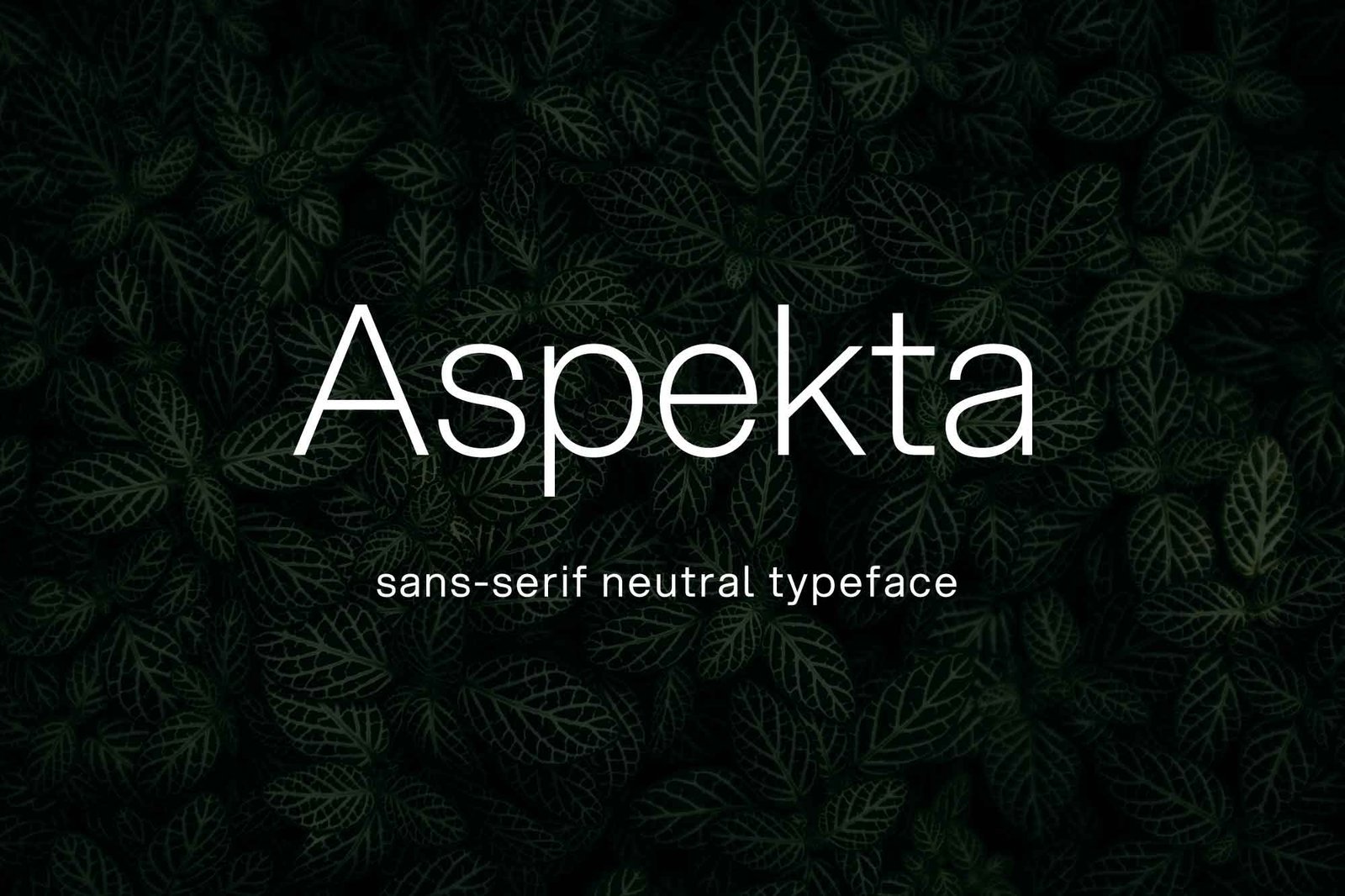
Aspekta Font is a sans-serif typeface with a simple, rational look. The design feels rooted in modernist ideas, with clean strokes and very little visual noise. It does not try to show off; instead, it stays quiet and functional, which can be a strength in many layouts.
The exact creator of this font is designer unknown, at least from the sources I could find. That said, the work feels considered. The structure shows a clear system behind each shape, which hints at a designer who cared about consistency and everyday use rather than visual tricks.
The letterforms are open and fairly wide, with clear counters that help legibility on both light and dark backgrounds. Spacing feels balanced out of the box, with a steady rhythm that holds blocks of text together. The mood is neutral, slightly technical, and dependable. It works well in grids and structured layouts, but might feel too reserved for very expressive, character-driven branding where a louder voice is needed.
Where Can You Use Aspekta Font?
I see Aspekta Font working well in digital products, corporate sites, and clean editorial layouts. At larger sizes, the shapes stay crisp and stable, so it suits headlines, dashboard labels, and cards. In branding, it can support a clear visual identity where other elements, like colour and imagery, carry the personality.
In smaller text, the sans-serif structure helps with quick reading, especially in UI and captions. On long paragraphs, it stays readable, but I would test line spacing carefully to avoid a slightly dense feeling. For body copy-heavy projects, pairing it with a softer serif can create a more human, comfortable reading flow.
For font pairing, I like matching Aspekta Font with a warm script or a geometric display face for contrast in headlines. It also sits nicely next to thin line icons and minimalist layouts. I would use it for tech brands, education platforms, portfolios, and any system that needs clarity first and style second.
Font License
Before you use Aspekta Font in any project, especially client or commercial work, always check the official licence details from the original source. Terms can change, and personal use does not always cover branding, apps, or products. I treat every font as licensed in a specific way until I read the rules myself.
In my own work, I now see Aspekta Font as a reliable, low-drama choice when I need a clear, modern base that gets out of the way and lets the design system speak.


Leave a Reply