

About Bahamas Font
I first reached for Bahamas Font during a branding mock-up for a beach café concept. I needed a loud, sun-soaked headline style that felt playful but still readable. This typeface caught my eye because it promised strong personality without drifting into full novelty territory.
The bold shapes and relaxed energy drew me in right away. I decided to test it across a small system of poster headers, social graphics, and a simple menu layout for Free Fonts Lab. I wanted to see if the font could stay consistent and usable once the early excitement faded.
Font Style & Design Analysis
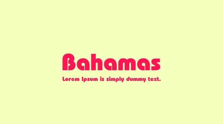
Bahamas Font is a pure display typeface, and it shows that proudly in every letter. The whole font family leans towards a fun, coastal mood, with chunky forms that feel warm and casual. It looks made for attention, not quiet body text, and that focus comes through clearly.
The exact creator of this font is designer unknown, which makes it harder to trace its design story. Even so, the work feels deliberate rather than random. The weight balance and basic structure suggest someone who understood how a display font must hold up at large sizes across varied layouts.
The letterforms are broad, with tight counters and simple details, which gives the typography strong impact on posters and covers. Spacing sits on the tighter side, so I often loosen the tracking a little for headlines. The rhythm feels steady rather than quirky, which helps with legibility. Its strengths lie in bold words and short phrases; long sentences start to feel heavy and crowded.
Where Can You Use Bahamas Font?
I see Bahamas Font working best in any project that needs bright, relaxed energy. Think summer event posters, travel ads, beach party flyers, children’s book covers, or playful packaging. At large sizes, the display shapes really shine, filling space with confident forms that grab attention from a distance.
At medium sizes, such as subheadings or short taglines, the font still reads well if you adjust spacing slightly. For small text, though, it breaks down; the heavy shapes and tight counters make long words blur together. I would never use it for paragraphs, menus with dense listings, or app interfaces where quick scanning matters.
The font pairs nicely with a clean sans-serif or quiet serif for body copy. I often combine this display style with a neutral grotesque typeface to stabilise the visual identity. Use Bahamas Font for the loud parts of the layout, then let a calmer partner handle the details and supporting information.
Font License
The licence for Bahamas Font can vary depending on where you obtain it. Some sources may allow personal work only, while others might permit broader commercial use. I always recommend checking the current licence terms directly at the official source before using it in any client or paid project. For me, it’s a fun tool when I need a bold, sunny display voice, as long as the project context and licence both fit.


Leave a Reply