

About Balmoral Font
I first reached for Balmoral Font while working on a wedding invitation set that needed a soft, classic script. The couple wanted something elegant, but not too fancy or hard to read. I was looking for a script that felt formal, yet still warm and human.
As I tested it across headings, names, and small notes, the font started to show its character. The loops, joins, and flowing strokes gave the design a traditional feel, almost like careful pen work. That first project led me to explore it further and write about it here for Free Fonts Lab.
Font Style & Design Analysis
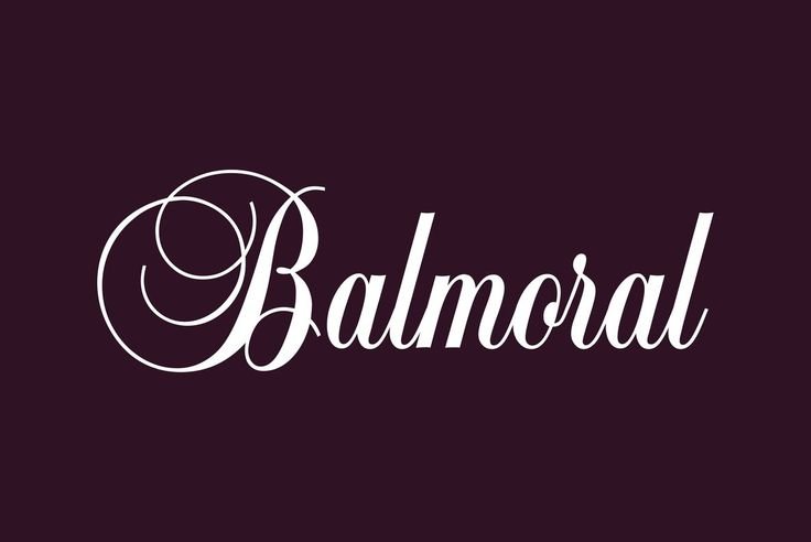
Balmoral Font is a classic script typeface with a strong calligraphic flavour. The strokes feel like they come from a pointed pen, with graceful entries and exits on many letters. The overall font style leans formal, with sweeping capitals that bring a sense of occasion and ceremony to a page.
The exact origin of the font is a bit unclear, so I have to treat the designer as unknown. That said, the structure suggests someone with a clear eye for traditional lettering. Many of the shapes echo older engraved invitations and formal certificates, which makes the font feel familiar and time-tested.
The letterforms join in a smooth rhythm, with flowing connections between most lower-case letters. Spacing is fairly tight, which suits a script design, though long words can start to feel dense. Capitals are tall and decorative, so they work best at larger sizes. The strength of Balmoral Font lies in its graceful curves and classic mood, but it is not ideal for long paragraphs or tiny text.
Where Can You Use Balmoral Font?
In real work, I find Balmoral Font most useful for projects that need a formal or romantic mood. Wedding invitations, event stationery, certificates, and classic branding pieces are all strong fits. It shines when used for names, headings, or short phrases where the curves have room to breathe.
At larger sizes, the details in the strokes feel rich and deliberate, which works nicely for logos or packaging that aims for a premium feel. When I use it in layouts, I often pair it with a clean serif or sans-serif body font to keep things readable. The contrast between a simple text face and this ornate script can create a clear visual hierarchy.
At small sizes, the joins and loops can start to merge, especially on screens. I avoid setting long sentences in this typeface, and I never use it for body copy or UI text. Instead, I limit it to headlines, signatures, or short taglines. Used with enough space and a calm layout, Balmoral Font can carry a strong, graceful visual identity.
Font License
Licensing for Balmoral Font can vary between sources, so I never assume it is free for every use. Before using it in client work, I always check the official licence terms to confirm what is allowed for personal and commercial projects. That small step keeps both me and my clients safe.
My simple takeaway as Ayan Farabi: Balmoral Font works best when you treat it like a special guest in your design, not the whole crowd.


Leave a Reply