

About Bickham Script Font
I first reached for Bickham Script Font while working on a formal wedding invitation set. The couple wanted something elegant, but not too dramatic or hard to read. I needed a typeface that felt classic, graceful, and polished without stealing attention from the names and details.
That project pushed me to test the font in print, on screen, and in different sizes. I paid close attention to how the script flowed in long names and short headings. For Free Fonts Lab, I then revisited the typeface more carefully to see where it shines and where it struggles in real design work.
Font Style & Design Analysis
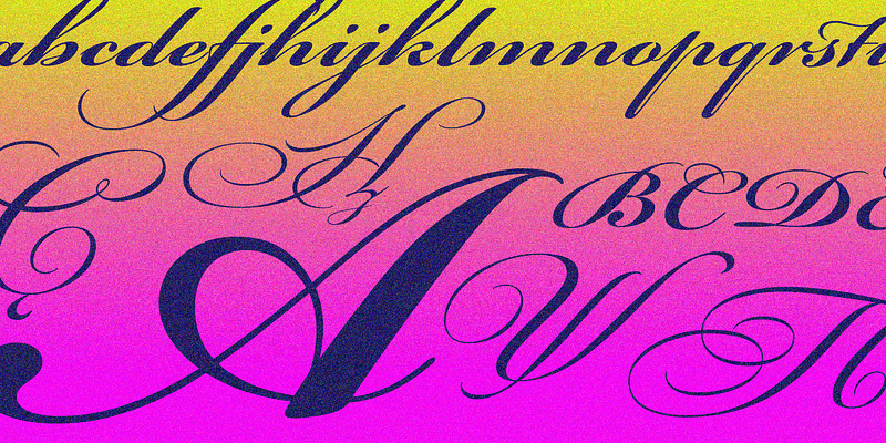
Bickham Script Font is a formal script typeface with a strong engraved and calligraphic flavour. It has sweeping curves, fine hairlines, and elegant loops that feel suited to very special occasions. The overall font style leans towards refined ceremony rather than casual handwriting or playful script.
The original design is widely known to come from Richard Lipton, a respected type designer with deep experience in classic lettering. Many digital versions exist, but they mostly aim to keep the same sophisticated tone and high-contrast structure. Some cuts are more detailed, while others simplify strokes for better screen use.
The letterforms show clear rhythm, with tall ascenders and generous swashes on capitals. Spacing is tight by default, which makes words feel connected and flowing, but it can also cause clashes in certain letter pairs. In my tests, the script category nature becomes both strength and limit: beautiful at display sizes, yet fussy in small text. It sets a charming, formal mood, but it is not built for dense paragraphs or heavy information.
Where Can You Use Bickham Script Font?
I find Bickham Script Font works best in ceremonial or luxury contexts. Wedding invitations, formal event stationery, certificates, and classic restaurant menus all benefit from its graceful forms. On larger titles, its script curves show beautifully, and the high contrast gives each word a sense of care and intention.
At smaller sizes, the fine hairlines and tight spacing become harder to read, especially on screens. I only use it for names, headings, or short phrases, never for body text. In brand work, it can support a premium visual identity when paired with a calm serif or a clean sans-serif that handles the main content.
For layouts, I usually keep it as a highlight element rather than the main font family. A simple supporting typeface lets this script style breathe and avoids visual noise. I also avoid all-caps settings, as the ornate capitals quickly feel crowded. When used with restraint, the typeface adds grace, romance, and a traditional sense of formality.
Font License
Licensing for Bickham Script Font varies between different foundries and digital versions. Some releases may allow personal use only, while others require a paid licence for commercial projects. Before using it in client work or products, always check the current licence terms on the official source and keep proof of your permission.
For me, this typeface remains a tool I bring in with purpose, not habit. When a project truly needs that level of formal script elegance, it earns its place in the layout.


Leave a Reply