

About Bodoni Moda Font
I first reached for Bodoni Moda Font while working on a calm, classic book cover for a small publisher. The brief asked for something elegant, but not old-fashioned or dusty. I needed a serif that felt sharp, modern, and still rooted in print history.
As I tested options for Free Fonts Lab, this typeface stood out quickly. The tall contrast, clean curves, and confident structure gave the layout a refined voice. It handled hierarchy well and gave my typography a clear system without looking stiff. That balance between fashion and readability made me want to explore it more in real projects.
Font Style & Design Analysis
Bodoni Moda Font is a high-contrast serif with a strong vertical stress and crisp, razor-like details. The thin hairlines sit next to thick stems, which gives the typeface a very polished, editorial feel. It pulls clear inspiration from classic Didone models, but the execution feels cleaner and more digital-native.
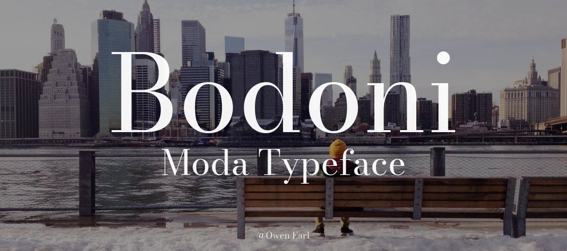
The font family is designed by Owen Earl, and you can see the care in each cut. The overall system includes multiple weights and optical sizes, which helps the typeface move between display and text roles. This kind of family planning shows a designer who understands both beauty and function in typography.
The letterforms have narrow proportions, pointed serifs, and very controlled curves. At large sizes, the rhythm feels dramatic and stylish, almost like high-end magazine mastheads. In smaller text, the extreme contrast can feel a bit delicate, so careful leading and tracking are important. As a serif font, it shines in headlines, titles, and short reading blocks, but will not be the safest choice for dense, tiny body copy.
Where Can You Use Bodoni Moda Font?
I find Bodoni Moda Font especially strong in editorial design, book covers, and refined branding systems. At large sizes, the contrast and sharp details really sing, giving logos, posters, and magazine headlines a bold, elegant voice. It works well where style and drama are part of the visual identity.
For body text, I use it with caution. In medium sizes, like pull quotes, menus, and short articles, it remains readable if the spacing is handled with care. For long reading on screens, I often pair it with a softer sans-serif or a more moderate serif to avoid eye fatigue. The serif structure still keeps things grounded and formal.
I like pairing this typeface with a clean geometric or neo-grotesque sans for contrast. The sharp Didone-style letterforms sit nicely next to simple, low-contrast companions. For luxury packaging, fashion lookbooks, or portfolios aimed at design-aware audiences, the font style adds instant polish. Used thoughtfully, it can anchor a whole visual system without shouting.
Font License
The licensing for Bodoni Moda Font can differ depending on where you access the font family. Always confirm what is allowed for personal, client, and commercial work. Before using it in a paid project or large brand system, check the official licence details from the original source. My own use stays within those terms.
For me, this typeface is a tool I reach for when I want a modern take on classic elegance, and I keep it in my kit for projects that need that precise balance.


Leave a Reply