
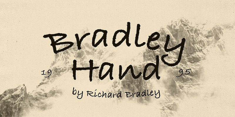

About Bradley Hand Font
I ran into the Bradley Hand Font while working on a relaxed diary-style layout for a lifestyle client. They wanted something that felt friendly, casual, and a bit like a real note from a person. My clean geometric fonts felt too formal, so I started searching for a softer handwritten voice.
The loose strokes and easy tone of this typeface caught my eye right away. It looked informal without turning childish, which is a tricky balance. I decided to test it across headings, pull quotes, and short captions for Free Fonts Lab, just to see how this handwriting style would behave in a real layout.
Font Style & Design Analysis
The Bradley Hand Font is a handwritten typeface that aims to mimic casual pen writing. The strokes feel like they came from a medium ballpoint or fine marker. It carries a relaxed energy, with letters that lean slightly and curve in a natural, unforced way. The font style sits between playful and practical, which makes it quite approachable.
The design is based on a classic system handwriting face, with the original designer often listed simply through platform credits or marked as designer unknown in many sources. That anonymity actually fits the mood of the font family. It feels like everyday writing, not a showpiece signature script. You can sense the goal was clarity first, personality second.
The letterforms are open and rounded, with clear counters and simple shapes. Spacing is fairly even, though some pairs feel slightly tight when you stack many lines together. The rhythm works best in short sentences and headings, where the handwritten flavour can breathe. In dense paragraphs, the repeated forms can look a bit mechanical. Its main strengths are legibility, warmth, and a friendly tone. Its limits appear when you push it into long body copy or very strict corporate typography.
Where Can You Use Bradley Hand Font?
The Bradley Hand Font shines in projects where you want a personal touch without losing clarity. I have used it for journal-style titles, recipe cards, and friendly onboarding screens. It gives notes, tips, and small callouts a human voice. As a handwritten option, it works best when the message feels direct and informal.
At larger sizes, the strokes read cleanly and the handwriting character becomes more charming. It works well for section headers, quotes on posters, or labels in a simple layout. At smaller sizes, it stays readable, but some of the subtle pen-like details disappear, so I avoid using it for long paragraphs or tiny captions.
For pairing, I usually match this typeface with a neutral sans-serif or calm serif for body text. That balance keeps the visual identity clean while letting the handwriting do the emotional work. Think children’s materials, personal blogs, lifestyle branding, crafts, or educational worksheets. It is less suited to strict luxury branding or highly technical layouts, where a more formal font family would feel more honest.
Font License
Licensing for the Bradley Hand Font can change depending on source and platform. Always check the official licence details before using it in client work, logos, or commercial products. I only treat it as safe for personal or test use until I have read the latest licence terms from the original distributor.
For me, this font works best as a gentle, human accent rather than a full system for every use. When I need a note that feels like it was written by a real person, it still earns a place in my toolkit.


Leave a Reply