
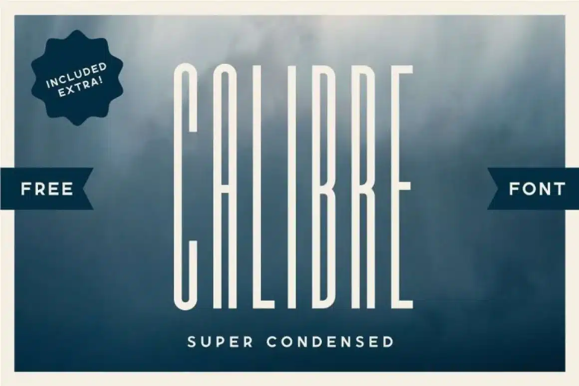

About Calibre Font
I first reached for the Calibre Font while building a clean, simple landing page for a tech client. They wanted something modern, confident, but not loud. I needed a typeface that could guide the eye without shouting. Calibre felt like a quiet but very precise choice.
As I tested it across headings, pull quotes, and short labels, its personality became clearer. The shapes looked calm yet firm, with a steady rhythm that worked well in bold layouts. I later wrote about this experience for Free Fonts Lab because the font raised some useful lessons about control, balance, and hierarchy in digital design.
Font Style & Design Analysis
Calibre Font belongs firmly in the display category, and you can feel that from the first large heading. The letters look pared back and sharply edited, with smooth curves and clean straight strokes. It is built for impact in big sizes, where the tight shapes and strong weight contrast draw attention quickly.
The font was created by the respected type foundry Klim Type Foundry, designed by Kris Sowersby. Knowing this helped me trust the underlying spacing and structure. Klim’s work usually shows careful testing across print and screen, and I could sense the same crafted discipline here while aligning text grids and baseline systems.
When I study the letterforms, I notice how the bowls on letters like “a”, “b”, and “d” feel compact but not cramped. The spacing feels even, which makes blocks of uppercase text stay readable. Still, as a display font family, Calibre performs best in headlines, short labels, and UI accents. In long paragraphs, the tight rhythm can feel slightly tense, so I prefer pairing it with a more relaxed text companion.
Where Can You Use Calibre Font?
I find Calibre Font especially strong in digital product interfaces, posters, and branding systems for modern companies. In large sizes, its structure becomes very clear, giving logos, hero headings, and dashboard labels a focused, rational voice. It works well when you want clarity without heavy decorative style getting in the way.
On screens, the font style holds sharp edges in bold and medium weights, which helps buttons, tabs, and navigation stand out cleanly. For small body text though, I usually avoid it or use it very carefully, because this display typeface feels a bit stiff when scaled down. In pitch decks and slides, large titles set in Calibre add a strong, organised tone.
For pairings, I often match Calibre with a softer serif for longer reading, or a neutral grotesque for body copy. This contrast lets the display role of Calibre stay clear, while the secondary font handles dense information. Used this way, the typography gains hierarchy: Calibre leads the eye, the partner font supports the story underneath.
Font License
Licensing for Calibre Font can vary based on source, usage, and number of users or views. I never assume it is free for commercial work. Before using it in client projects or paid products, I always check the official licence terms from the current distributor and follow those conditions closely.
For me as Ayan Farabi, Calibre works best when I need a serious, controlled voice that still feels modern. It is not a magic solution for every layout, but when used in the right size and role, it becomes a very dependable anchor for clear visual identity.


Leave a Reply