

About Caslon Antique Font
I reached for Caslon Antique Font while working on a book cover that needed a worn, historic voice. The story sat in a fantasy world, but the client wanted it to feel rooted in real history. Modern typefaces were too clean, and standard classics felt a bit safe and predictable.
This typeface caught my eye because it carries age in a believable way. The texture looks imperfect, yet intentional. I tested it across headings and short pull quotes for that project, then explored it further for an article on Free Fonts Lab. It left a strong first impression, both visually and in how it behaved in layout.
Font Style & Design Analysis
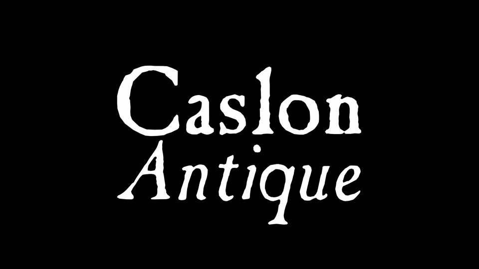
Caslon Antique Font is a serif typeface with a rough, time-worn surface. You can feel an old printing press mood in every glyph. The stroke contrast is fairly modest, and the serifs look chipped and softened, as if they passed through many print runs on rough paper. It reads like a classic book face that has survived decades of heavy use.
The original design dates back many years, and in most digital releases the designer is unknown or credited only in fragments. What matters in practice is how the font family has been digitised and cleaned up. Some versions keep more grunge; others soften the wear for better legibility. This lack of a single, clear author adds to its anonymous archival charm.
The letterforms lean slightly uneven, which gives the typography a human, imperfect rhythm. Caps feel strong and work well for titles and logos, while lowercase can appear busy if you set long paragraphs. Spacing is on the tight side, so I usually add a bit of tracking for headings. The mood is aged, dramatic, and a little theatrical. It shines in bold statements but struggles in dense body copy or tiny captions, where the texture can break up and feel muddy.
Where Can You Use Caslon Antique Font?
I like Caslon Antique Font most in projects that need history, mystery, or a slight gothic edge. Think book covers, game titles, posters for period films, or museum graphics. At large sizes, the serif detailing reads clearly, and the distressing becomes a design feature instead of a flaw. It instantly sets a nostalgic visual identity.
For smaller sizes, I treat it more carefully. In subheadings, menus, or short labels, it holds up if you give it enough line spacing. I would not use it for long paragraphs, manuals, or UI text. The texture and tight spacing can tire the eye, especially on screens. Instead, I pair it with a clean serif or sans-serif for body text and let Caslon Antique handle the expressive parts.
In branding work, it suits craft shops, heritage brands, fantasy games, or escape rooms that want an old-world feel. It works well on packaging, posters, and chapter titles. Combine it with simple layouts, generous margins, and low-colour palettes to avoid visual noise. Used with restraint, this serif can anchor a design with strong character without overwhelming the rest of the typography.
Font License
Licensing for Caslon Antique Font varies between foundries and digital releases. Some versions may allow personal use only, while others include commercial rights. Before using it in any client project or product, I always check the licence terms on the specific source and keep a record of that permission.
For me, Caslon Antique works best as a specialised tool, not a daily workhorse. When a project needs authentic age and printed history, it earns its place in my typographic toolbox.


Leave a Reply