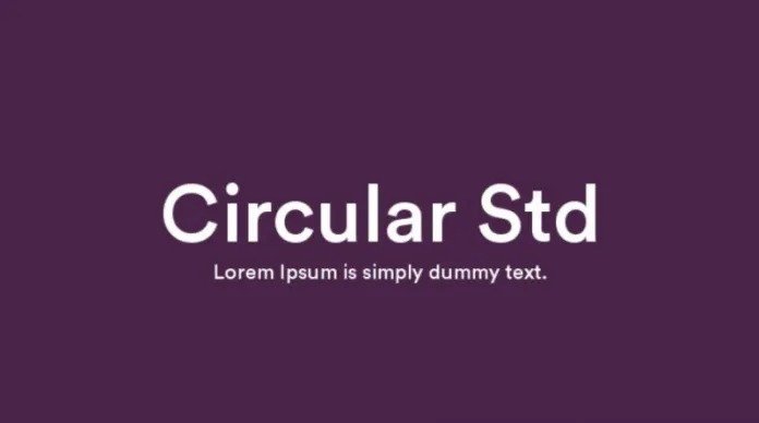
About Circular Std Font
I first tried Circular Std Font while working on a clean, modern dashboard for a tech client. I needed something neutral, but not cold. The brief asked for a clear, friendly typeface that still felt grown-up. Circular Standard Font came up often in references, so I decided to test it seriously.
As I used it in layouts, the font started to make sense very quickly. Its shapes felt balanced, tidy, and confident without shouting for attention. I shared some early screens on Free Fonts Lab, and the feedback from other designers confirmed my first impression. This is a font that simply gets out of the way and lets the design breathe.
Font Style & Design Analysis
Circular Std Font is a sans-serif typeface with a calm, geometric spirit. The basic shapes feel built from circles and straight lines, yet the curves are softened just enough. Nothing looks too sharp or mechanical. That mix gives the font family a clean, modern look that still feels human and approachable.
The typeface comes from the foundry Lineto, and it is often linked with modern brand systems and digital products. Knowing its design background helped me trust it for interface work and branding tasks. You can see the care in the spacing, the curve tensions, and the overall consistency across weights and styles.
When you look closely at the letterforms, you notice how even the structure feels. The bowls on letters like “a” and “e” are open, which helps legibility at smaller sizes. Spacing is steady, so text blocks sit in a smooth rhythm. The mood stays neutral but friendly. The main limitation is personality: if you need drama or strong character, this sans-serif might feel too reserved.
Where Can You Use Circular Std Font?
I reach for Circular Std Font when a project needs clarity and trust. It works well for tech brands, finance, lifestyle apps, and simple editorial layouts. In logos, it can give a direct, honest feel, especially when paired with strong colour and simple shapes. It supports many modern visual identity systems quite well.
In large sizes, the geometric nature stands out nicely. Headlines, hero banners, and big UI labels look sharp and precise. The round counters and clean strokes hold up on high-resolution screens and in print. At smaller sizes, the sans-serif structure helps with readability, especially in dashboards, forms, and navigation elements.
For pairing, I often combine Circular Standard Font with a warm serif for body copy, or with a contrasting display font for titles. In grid-based layouts, its regular spacing makes alignment easy. For long text, lighter weights work better than very bold ones, which can feel a bit dense. Used with enough white space, the font style supports quiet, confident typography.
Font License
Circular Std Font is a commercial typeface, and licence terms can change over time. Before you use it in client work or products, always review the current licence from the official source. Check carefully whether your plan covers desktop, web, app, or logo use. I never skip this step, especially for larger branding projects.
For me, Circular Std Font is a reliable tool when I need modern simplicity that will age well. It does not try to be clever; it just performs, which is often exactly what a design needs.


Leave a Reply