

About Dcc Ash Font
I came across Dcc Ash Font while searching for a bold, graphic title style for a poster series. The brief needed something loud, sharp, and a bit rough around the edges, but not childish. The font stood out because it felt dramatic without turning into pure chaos.
I first tested it on a music event layout for Free Fonts Lab, then later on a gaming banner concept. In both projects, the typeface gave me a strong visual hook right away. I wanted to see how far I could push this font family in real layouts, especially with colour, texture, and tight grids.
Font Style & Design Analysis
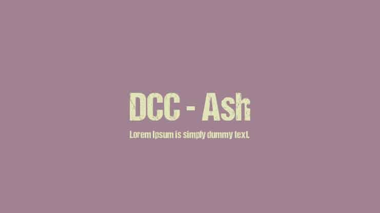
Dcc Ash Font is a pure display typeface, built for impact rather than quiet reading. The shapes feel angular and aggressive, with a strong graphic presence that jumps off the page. It looks like something cut from rough metal or scratched onto a wall, which makes it very theatrical.
The designer is unknown, at least from the sources I could find. That does not hurt the font’s use, but it does mean I treat the file more carefully. When the creator is unclear, I always double-check licence notes and avoid assuming anything about allowed use in bigger brand systems.
The letterforms have heavy strokes, sharp corners, and tight inner spaces, which gives the typography a dense rhythm. In large sizes, the texture feels strong and deliberate; in small sizes, the details start to blur. Spacing is fairly tight, so I often add a touch of tracking for longer words. The mood leans dark, gritty, and intense, which is a strength for bold posters but a clear limitation for calm or minimal identities. As a display font, it works best in short bursts of text.
Where Can You Use Dcc Ash Font?
I find Dcc Ash Font most effective in posters, game covers, event titles, and heavy branding for music or streetwear. It suits audiences who enjoy strong, edgy visuals, like metal bands, esports teams, or horror events. Put it big on the page and let it carry the visual identity for the headline.
In large sizes, the font style shows its texture and attitude very clearly. Each character feels like part of a rough, carved surface. In smaller sizes, though, the thick strokes start to merge, which hurts clarity. I avoid using it for body copy, captions, or UI text, because it quickly becomes hard to read.
For pairing, I usually match this display font with a clean sans-serif or simple serif for supporting text. A plain, neutral typeface beside it gives the eye a place to rest. I keep line spacing generous around the title, use strong contrast in colour, and limit the number of words. Short, sharp lines let the font do its best work.
Font License
The licence for Dcc Ash Font can vary depending on where you download it, so I never assume it is free for commercial work. Always read the licence text from the original source and confirm whether personal, client, or commercial projects are allowed before using it in a final design.
For me, this font is a useful tool when I need a loud, gritty headline that dominates the layout. I reach for it when subtlety is not the goal, and I am happy to keep it in my toolkit for the right kind of intense, focused projects.


Leave a Reply