
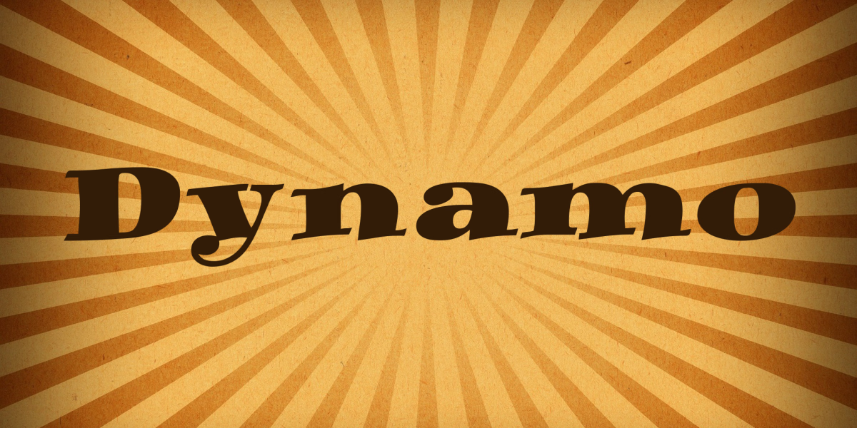

About Dynamo Font
I came across Dynamo Font while testing options for a clean, modern interface project. I needed a typeface that felt neutral but not cold, clear but not boring. Dynamo caught my eye because its shapes looked sturdy, yet the curves felt friendly enough for everyday users.
That balance made me curious, so I downloaded it and ran a few layout tests for menus, buttons, and headers. As I worked through my mockups for Free Fonts Lab, I realised Dynamo had a practical charm. It did not shout for attention, yet it held the page with quiet confidence.
Font Style & Design Analysis
Dynamo Font is a sans-serif typeface with a clean, geometric leaning. The strokes feel even and controlled, with no dramatic contrast. Its overall direction sits between technical and approachable, which makes it look modern without feeling too trendy. It gives that calm, ordered tone many digital products need today.
The exact origin of this font is unclear, so I will list the designer unknown. That said, the font family feels like it was drawn with interface work in mind. The character set focuses on core Latin support, so it suits everyday branding, web, and product tasks where you do not need complex language coverage.
The letterforms have straightforward shapes, with open counters that help readability on screens. Spacing is slightly on the tight side, especially in uppercase, so I often add a bit of tracking for headings. The rhythm stays steady, which gives paragraphs a smooth flow. As a sans-serif, it works best for clear, direct communication but might feel too plain for expressive, artistic layouts.
Where Can You Use Dynamo Font?
I found Dynamo Font most effective in user interfaces, dashboards, and clean corporate layouts. At larger sizes, like section titles or hero text, its simple forms stay sharp and easy to scan. In logos, it can work for tech, finance, or SaaS brands that want a no-nonsense, modern tone without heavy personality.
At smaller sizes, Dynamo holds up reasonably well, especially on screens. Body text at regular weight remains legible, though I avoid very long reading passages with it. For websites, I like pairing Dynamo with a softer serif for body copy. This mix gives a stronger visual identity while keeping navigation and labels crisp.
For print, Dynamo suits brochures, product sheets, and brand guidelines where clear structure matters. It also works in slide decks, app mockups, and wireframes because it does not distract from the content. I usually pair this sans-serif with a contrasting display or script font for accents, to avoid a flat or overly rigid look.
Font License
Before you use Dynamo Font for client work or commercial projects, always review the official licence terms. Some versions allow personal or testing use only, while others may need a paid licence. I always recommend checking the source carefully so your usage stays safe and compliant.
My honest take: Dynamo is a steady, practical choice when you need quiet clarity more than strong character. I reach for it when the design should support the message, not compete with it.


Leave a Reply