

About Erotica Font
I first tried Erotica Font while working on a small poetry zine that needed something soft but not childish. I wanted handwriting that felt personal, like a note passed between friends, yet still readable on a printed page. The name made me cautious, but the shapes kept me curious.
As I tested it inside layout mockups for Free Fonts Lab, the font started to make more sense. It brought a quiet, handwritten charm to short lines of text and titles. I decided to push it through a few different colour themes and backgrounds to see how stable the mood stayed in real design use.
Font Style & Design Analysis
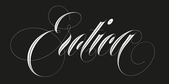
This is a handwritten typeface with a loose, casual line and a gentle slant. The strokes look like they were drawn with a smooth pen rather than a brush, so the texture stays clean. It feels like quick, confident handwriting, not overly romantic, but still intimate and human.
The creator of this font is designer unknown, which does affect how much technical detail we can trace about its development. Without clear documentation, I rely on how the font behaves in layout tests. I pay attention to curve quality, spacing decisions, and how consistent the overall font family feels in different words.
The letterforms use rounded corners and relaxed loops, which give the typography a friendly tone. Lowercase letters sit quite close together, creating a tight rhythm that works best at medium sizes. Spacing is a bit narrow, so long passages can feel dense. The font style shines with short phrases, names, and expressive headings, but it struggles when pushed into heavy body text.
Where Can You Use Erotica Font?
I see Erotica Font fitting well in projects that need a warm, personal voice without looking messy. Think love notes on packaging, quote graphics for social media, or captions on lifestyle photos. At larger sizes, the handwritten details read clearly and add character to simple layouts.
On smaller text, especially long paragraphs, this handwritten font starts to lose some clarity. The close spacing and looping shapes can blur together on low-resolution screens. I keep it for headings, short intros, or callouts rather than main body copy. It works nicely on invitations, journal covers, or mood boards where emotion matters more than speed reading.
When pairing it with other fonts, I usually match Erotica Font with a clean sans-serif for body text. This contrast keeps the visual identity balanced. The handwritten style handles the expressive parts, while the partner typeface carries information. Used this way, the handwritten energy feels intentional, not overwhelming.
Font License
Before using Erotica Font in client work or products for sale, it is important to check the licence from the original source. Permissions for personal projects and commercial use can be different, and terms may change over time. I always review the latest licence details before final export.
My honest takeaway as Ayan Farabi: I reach for this font when I need subtle, handwritten warmth in short text, and I avoid it for long reading passages or very small sizes.


Leave a Reply