
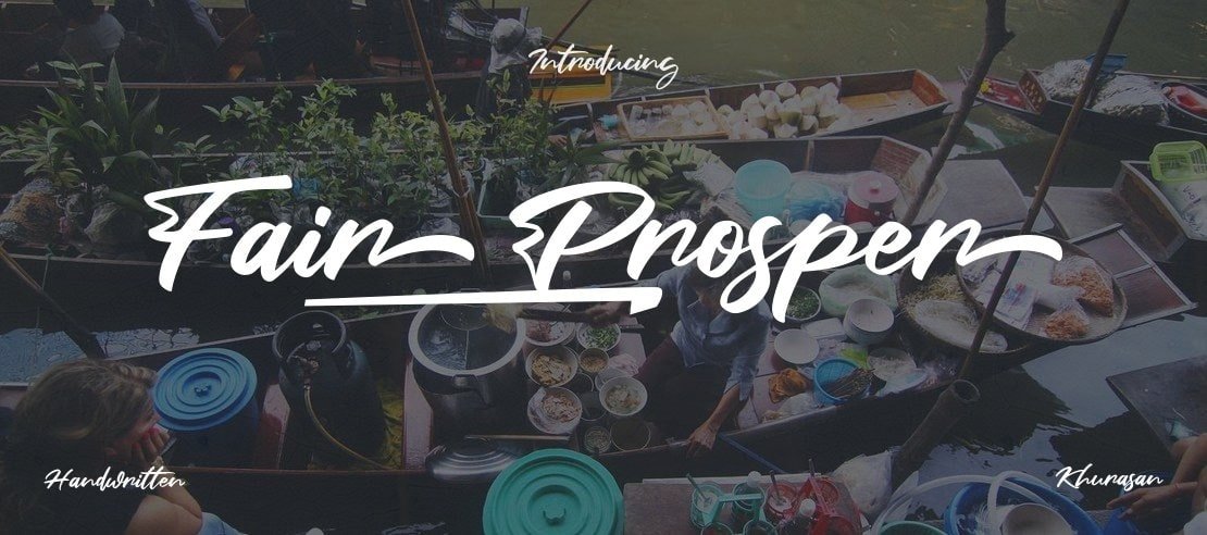

About Fair Prosper Font
I came across Fair Prosper Font while searching for a soft, elegant script for a wedding invite set. I needed something graceful but still readable for long names and dates. Many scripts looked pretty at first, then fell apart in real layouts. This one made me pause and look closer.
I tested it on a full stationery suite for a personal project and later used it again for a small brand concept at Free Fonts Lab. What drew me in was the mix of flowing curves and calm rhythm. It promised that romantic feel without turning the design into hard-to-read swirls.
Font Style & Design Analysis
Fair Prosper Font is a calligraphy typeface with a clear focus on smooth, connected strokes and gentle contrast. The letters feel like careful pen work rather than quick handwriting. It leans towards a modern calligraphic look, with elegant loops, long entry strokes, and a polished, decorative rhythm.
The designer is unknown, but the overall build shows a decent eye for balance. The font family seems made for display use first, not body text. The weight feels light to medium, and the curves suggest a digital calligraphy brush rather than classic nib work. It sits somewhere between formal wedding script and casual boutique branding.
The letterforms have tall ascenders, wide swashes, and often tight connections between characters. This gives strong flow, but it can also crowd lines if tracking stays at default. The spacing is fairly even for short words, though long phrases need extra care. The mood is romantic and feminine, which works well, but limits its range for neutral or corporate identities. As a calligraphy style, it shines when used in short, expressive phrases, not dense paragraphs.
Where Can You Use Fair Prosper Font?
I found Fair Prosper Font works best in large display sizes, where its loops and swashes have space to breathe. Wedding invitations, save-the-date cards, and event titles are natural fits. It also suits boutique logos, beauty brand wordmarks, and packaging that leans into soft, personal storytelling.
At medium sizes, like subheadings or pull quotes, it can still perform well if line spacing is opened up a little. I avoid using it for long paragraphs or small captions, because the script curves start to blend together. For social media posts, it looks strong on short quotes, names, or main headline text over simple backgrounds.
Pairing-wise, I usually set Fair Prosper Font with a clean sans-serif or a calm serif for body text. A neutral typeface helps control the visual noise and keeps layouts grounded. I also keep colour simple: soft dark greys, warm browns, or muted pastels let the calligraphy shapes take the lead without competing effects.
Font License
The licence for Fair Prosper Font can vary depending on the source, so I never assume it is free for commercial work. It may be fine for personal projects, tests, or study, but any client or paid use should follow the official licence terms. Always check the current licence information from the original distributor before you commit it to a final design.
For me, Fair Prosper Font is a pleasant choice when I want expressive, romantic script without extreme flourishes. It is not a universal solution, but in the right project, it brings a gentle, human touch that feels considered rather than loud.


Leave a Reply