
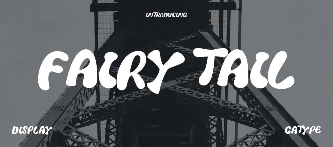

About Fairy Tail Font
I came across the Fairy Tail Font while hunting for a playful headline style for a fantasy-themed poster. I needed something bold, loud, and a bit magical, but not too hard to read. The font stood out right away because it has a strong comic and anime vibe that felt perfect for that mood.
I decided to test it in a few layouts for a fan event design I was building for Free Fonts Lab. I tried it on banners, social posts, and a simple title lockup. The font handled those uses quite well, as long as I kept it large and gave it space to breathe.
Font Style & Design Analysis
The Fairy Tail Font is a display typeface built for attention, not for long reading. Its letterforms feel dramatic and stylised, with sharp edges and bold strokes that echo anime logo design. The overall font style leans toward fantasy adventure, with a mix of playful curves and aggressive points that create a strong visual identity.
The designer is listed as designer unknown, which is common with fan-made fonts based on popular series. Because of that, I always treat it as an informal option, not a core brand font family. It feels more like a tribute to the source material than a fully refined professional system, and that guides how I choose to use it.
The shapes are wide, with tight spacing and heavy contrast between thick and thin parts. This gives the typeface a punchy rhythm but can make some letter pairs feel cramped. At large sizes, the energy works very well. At smaller sizes, fine details blur, and the texture gets noisy. As a display font, it shines in bold titles but struggles in dense text or complex layouts.
Where Can You Use Fairy Tail Font?
I find the Fairy Tail Font most effective in fan projects, posters, and event graphics linked to anime, games, or fantasy themes. It works nicely for convention flyers, stream overlays, and YouTube thumbnails where loud, fun typography matters more than subtlety. Young audiences and genre fans respond well to this kind of expressive style.
In print, I keep it for main headings, logos, or short taglines at big sizes. Anything under medium size starts to lose clarity because of the intricate shapes and tight spacing. On screen, it performs better when used in bold, high-contrast layouts. I avoid using it for buttons, UI labels, or body copy, as readability drops fast.
For pairing, I usually combine this display font with a clean sans-serif for body text, sometimes even a simple geometric typeface. That contrast keeps the layout balanced and stops the design from feeling chaotic. When I build a visual identity around it, I keep the colour palette simple so the letterforms remain the main star.
Font License
The licence for the Fairy Tail Font can vary depending on the source, especially since it is inspired by existing media. I always check the original download page to confirm what is allowed for personal and commercial projects. If there is any doubt, I treat it as personal-use only and look for a safer option for client work.
For me as Ayan Farabi, this font is a fun, niche tool I reach for when a project needs that specific anime-style drama, but I never rely on it as a core branding typeface.


Leave a Reply