
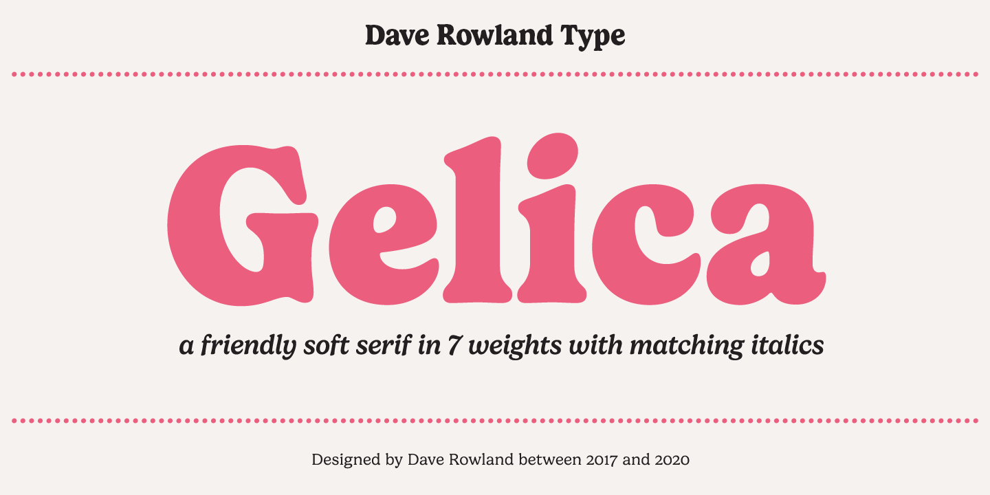

About Gelica Font
I first tried Gelica Font while working on a calm, book-style cover for a wellness brand. I needed a serif that felt gentle, not stiff, and still looked clear in print. The soft curves and quiet confidence of this typeface caught my eye right away.
I decided to test it across a full layout, not just the logo. Chapter titles, pull quotes, body copy tests — I ran it through all of them. For readers at Free Fonts Lab, I wanted to understand how this font behaves in real work, not just in a specimen image.
Font Style & Design Analysis
Gelica Font is a serif typeface with a balanced, modern-classic feel. The serifs are smooth and slightly softened, which gives the font a friendly tone instead of a strict, formal one. It sits somewhere between bookish and stylish, so it can support both text and display roles with ease.
The designer is unknown, at least from what I could verify while testing and researching the font family. That said, the work shows a clear, thoughtful eye. The proportions feel well considered, and the curves suggest someone who understands modern editorial typography quite well.
The letterforms have a gentle contrast between thick and thin strokes, so the rhythm feels calm and readable. Spacing is generous without feeling loose, which helps at smaller sizes. In headings, the font style shows a quiet elegance, but not drama. It does struggle slightly in very tiny captions, where thin details can fade. For bold branding, you may need stronger weights or a secondary display font.
Where Can You Use Gelica Font?
I see Gelica Font working nicely in editorial layouts, wellness brands, and thoughtful lifestyle projects. It suits audiences who value calm, clarity, and a touch of softness. On book covers, brochures, and blog headers, it gives a gentle, trustworthy mood rather than a loud or trendy one.
In large sizes, the serif details and curves really shine. Titles, section headers, and pull quotes feel refined and clean. At medium text sizes, like long articles or guides, the serif structure supports comfortable reading. For very dense body copy, I would run tests, but it holds up well in short to mid-length paragraphs.
For pairing, I like it with a simple sans-serif for UI elements or captions. Let Gelica Font take care of headlines, intros, or main reading text, and use the sans-serif for menus, labels, and smaller notes. This keeps hierarchy clear and gives layouts a grounded, human tone without visual noise.
Font License
The licence terms for Gelica Font can change, and different sources may offer different rights. Do not assume it is free for commercial projects, even if you find a free download. Always read the official licence carefully and confirm permissions for client work, print use, and large-scale branding.
My honest take: I reach for this serif when I want something calm, readable, and slightly delicate, especially for brands that speak in a gentle, human voice.


Leave a Reply