
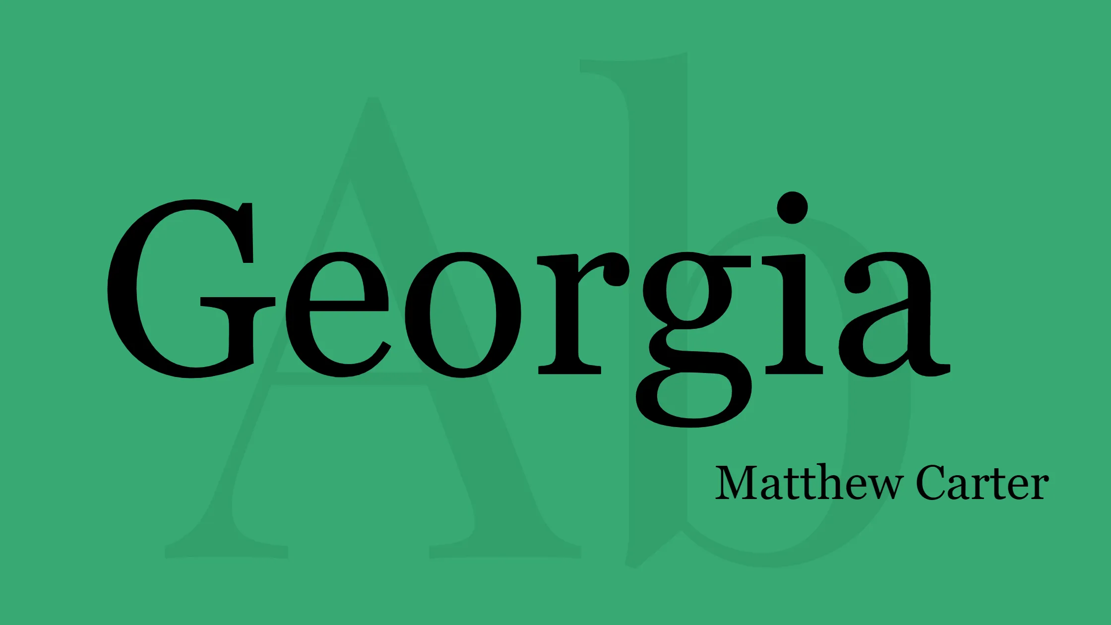

Georgia is a popular serif typeface designed by Matthew Carter and hinted at by Tom Rickner for Microsoft in 1993. This classic font was specifically created to maintain its elegance and legibility even when displayed at small sizes or on low-resolution screens. Georgia is a typeface that was created based on Scotch Roman designs from the 19th century. The designer Carter created a famous typeface called Miller, and also developed another font alongside it.
Key Features of Georgia Font:
- Designer: Matthew Carter: Georgia Font was skillfully designed by Matthew Carter, a highly respected typeface designer known for his contributions to the field of typography. Carter’s expertise shines through in the careful craftsmanship of Georgia.
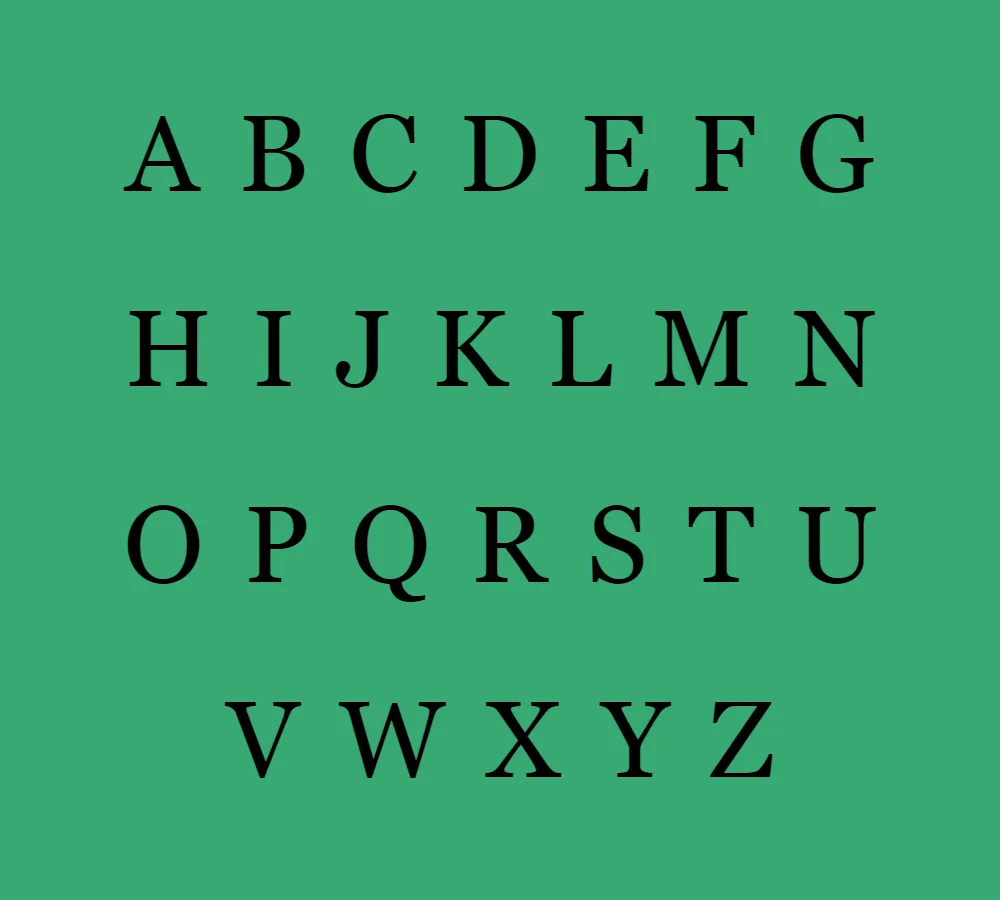
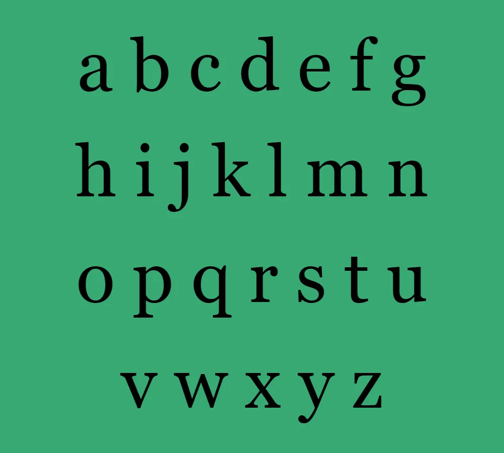
- Serif Typeface: Georgia is a serif typeface, which means it features small decorative lines or strokes (serifs) at the ends of each letter. Serif fonts are widely used for their traditional and classic appeal, making them suitable for various applications.
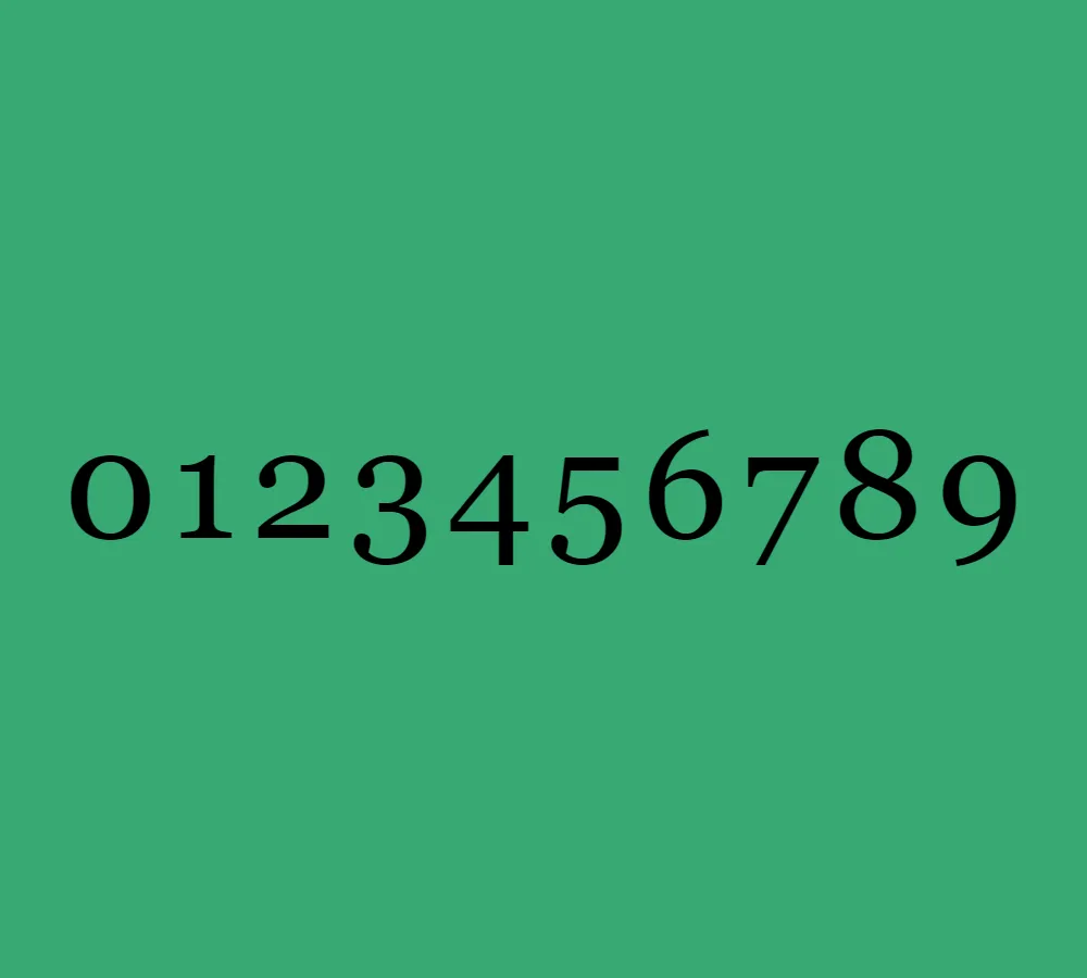
- Elegance and Legibility: Georgia strikes a perfect balance between elegance and legibility. Its design ensures that the font maintains its sophistication while being easily readable, even in small sizes or on screens with lower resolutions.
- Scotch Roman Influence: The design of Georgia Font is influenced by Scotch Roman typography, a style popular in the 19th century. This inspiration adds a touch of timeless elegance to Georgia’s aesthetic.
- Miller Typeface Connection: The Georgia Font and the Miller typeface were both created by Matthew Carter and share the same origins. The two typefaces were developed simultaneously, with Miller being released the following year.
- Free for Personal Use: Georgia Font is free for personal use and can be used in personal projects without any charge. It has an elegant appearance and is highly legible.
Georgia Font is a versatile typeface that finds its applications in various contexts:
- Print Design: Georgia is a popular choice for print design due to its classic and elegant appearance. It can be used for various print materials such as books, magazines, brochures, and posters.
- Web Design: As Georgia was specifically designed to maintain legibility on screens, it has become a widely used font for web design. Its clean lines and readability make it an excellent choice for body text on websites.
- User Interfaces: Georgia’s legibility on low-resolution screens also makes it suitable for user interfaces, including menus, buttons, and labels. Its versatility allows it to blend seamlessly with different design styles.
- Branding and Identity: The timeless elegance of Georgia Font makes it a popular choice for branding and identity design. It can convey a sense of sophistication and professionalism for various businesses and organizations.
In conclusion, Georgia Font, designed by Matthew Carter, is a serif typeface known for its elegant appearance and excellent legibility. This font draws inspiration from Scotch Roman typography and is connected to the Miller typeface, making it a timeless choice. Whether used in print or digital design, Georgia brings a touch of class and readability to any project.


