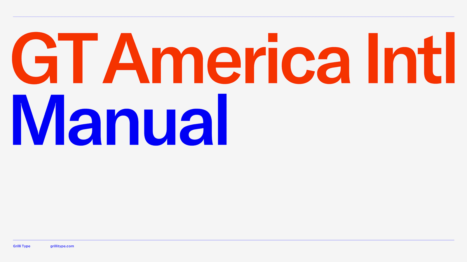
About Gt America Font
I first reached for Gt America Font while working on a clean brand refresh for a tech client. They wanted something modern, but not cold. I needed a typeface that felt neutral, flexible, and trustworthy, without stealing attention from the product itself.
As I tested options for Free Fonts Lab, this font kept catching my eye because of its calm voice. It sits in that space between classic Swiss style and a more contemporary groove. I decided to live with it across a full layout: headlines, body text, UI labels, and basic branding pieces.
Font Style & Design Analysis
Gt America Font is a sans-serif typeface with a clear, quietly confident look. It borrows a lot from mid-century grotesque styles, but adds small refinements that feel current. The shapes are straightforward and honest, which gives the font a very reliable and steady tone on the page.
The typeface comes from the well-known foundry Grilli Type, who are known for thoughtful, detail-focused typography. Their work usually balances function and character, and I can feel that here too. Nothing in this font family seems random; every curve and terminal feels like it was checked many times.
The letterforms look sturdy, with simple strokes and just enough contrast to stay readable on screen. Spacing is quite even, so text blocks feel smooth and calm instead of noisy. The rhythm works very well in long lines. It shines in mid to large sizes, but smaller text can feel a bit tight if tracking is not adjusted. As a sans-serif family, its strength is clarity; if you want strong personality or drama, this is not the right voice.
Where Can You Use Gt America Font?
I find Gt America Font very dependable for branding, especially for tech, product design, and modern corporate identities. It works well for teams who want a serious, grown-up voice without looking old-fashioned. In logos and wordmarks, the clean shapes give you a stable base to customise.
In large sizes, such as headlines, posters, and hero sections, the font shows its balance and refinement. The simple geometry holds up well on high-resolution screens and print. For body text on web or app UI, I usually open the spacing a touch, which makes long reads more comfortable for different audiences.
It pairs nicely with a warm serif for editorial-style layouts, or with a lighter humanist sans for softer interfaces. I often use a bolder weight of this font for headings, and a different, more relaxed typeface for long paragraphs. Used this way, Gt America Font becomes the anchor that keeps the visual identity grounded.
Font License
Licensing for Gt America Font depends on the source, project type, and usage scale. You should never assume it is free for commercial work. Always check the official foundry or distributor for current licence terms, and make sure your client or team holds the correct rights.
For me, this font is a tool I trust when I need quiet strength and clear structure. If a project calls for subtle authority instead of loud character, this is one of the first typefaces I consider.


Leave a Reply