

About Gypsy Curse Font
I came across Gypsy Curse Font while searching for a spooky title style for a small poster series. I needed something that felt eerie, but not childish or too messy. The name caught my eye first, but the letterforms kept me interested long enough to test it in a real layout.
I tried it on a horror movie night poster and a simple social media graphic for a friend’s event. In both tests, the font gave a strong mood right away. It looked themed without feeling cheap. That balance is why I decided to review it in detail for Free Fonts Lab and see where it actually works.
Font Style & Design Analysis
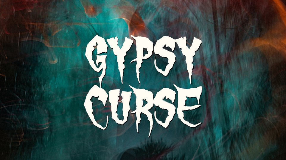
Gypsy Curse Font is a halloween display typeface with a very clear horror tone. The shapes feel sharp and uneasy, almost like rough cuts in paper or scratched marks. It gives that classic haunted house vibe, the kind you see on old VHS covers and seasonal posters. The style leans into drama rather than subtlety.
The designer is unknown, at least from every source I could confirm. That does limit deeper context about the original brief or intent. Still, the design choices feel deliberate. The weight, texture, and edges suggest someone studied classic halloween posters and then pushed the look into a more modern, bolder form.
The letterforms are wide, jagged, and slightly irregular, which suits a halloween theme very well but also adds visual noise. The spacing is tight, so words form dense, heavy blocks. That helps for big titles, yet makes long text tiring to read. The rhythm feels choppy by design, which builds tension but kills readability in paragraphs. In short, strong mood, limited flexibility.
Where Can You Use Gypsy Curse Font?
I see Gypsy Curse Font working best in bold, themed projects where the message is short and loud. Think horror movie posters, haunted house flyers, escape room branding, or halloween party invites. At large sizes, the rough details become clear and the drama really lands. It demands attention on a page or screen.
At smaller sizes, the texture and sharp angles start to blur together. On mobile screens, thin cuts can vanish, especially on low contrast backgrounds. I would not use this font for body copy, menus, or anything with long sentences. Instead, keep it for headings, logos, and short taglines that support a strong seasonal or horror identity.
For pairing, I usually place this font with a clean sans-serif or a quiet serif for body text. A neutral typeface keeps the layout readable while Gypsy Curse Font delivers the halloween hit. I avoid using more than one decorative font family in the same design, or the page starts to feel chaotic and less professional.
Font License
Licensing for Gypsy Curse Font can vary between sources, so I never assume it is free for every use. Before using it in client work or paid projects, check the official licence terms carefully. Make sure your planned personal, commercial, or web use matches what the creator allows.
My personal takeaway as Ayan Farabi: I reach for this font when I need a focused halloween mood, not a flexible workhorse. Used with care, it can give a small project a bold, eerie voice without much extra decoration.


Leave a Reply