

About Hunting Font
I came across Hunting Font while I was searching for a calm, elegant script for a small wedding invite project. I needed something soft, readable, and not too flashy. Many options looked either messy or overly dramatic, so this typeface caught my eye right away.
The first thing that pulled me in was its gentle flow. The strokes feel careful and controlled, not wild or rushed. I decided to test it in a few layouts for print and social media posts, then wrote up my notes for Free Fonts Lab so other designers could see how it behaves in real work.
Font Style & Design Analysis
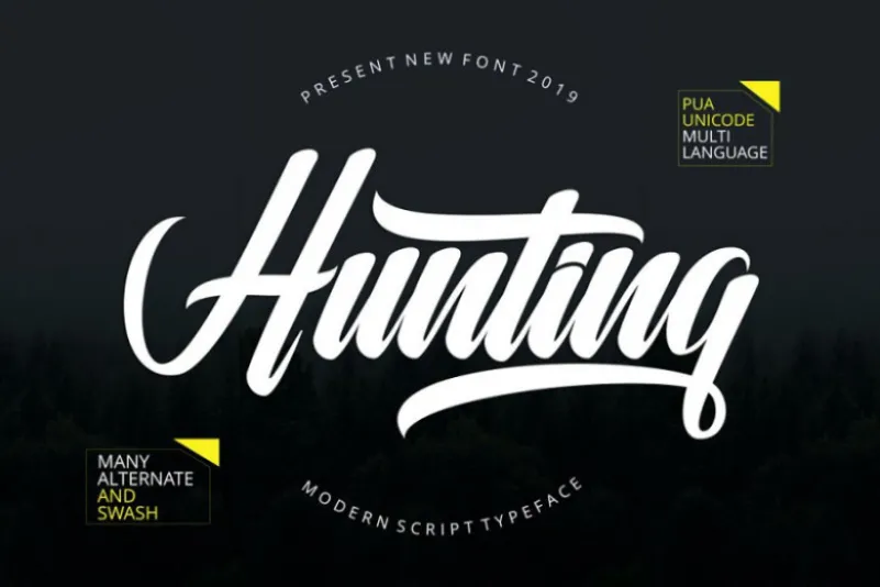
This is a calligraphy typeface with a clean, graceful line and a relaxed personality. The forms sit between formal invitation script and casual handwriting. The curves are smooth, with light contrast between thick and thin strokes. It feels like careful pen work rather than quick brush lettering, which gives it a steady rhythm.
The designer is unknown, at least from what I could confirm. Because of that, I treated the font family as I would any uncredited resource: with extra testing and caution. I checked its character set, spacing, and basic language support before using it in any client-facing mockups.
The letterforms have rounded joins and open counters, so words breathe nicely on the page. Spacing is slightly tight, especially in double letters, so I often add a bit of tracking. The typography mood is romantic and gentle, good for names, titles, and short lines. Longer paragraphs feel heavy and less comfortable to read, so I avoid it for body text. As a calligraphy font style, its strength lies in expressive headlines, not dense copy.
Where Can You Use Hunting Font?
I find Hunting Font works best in projects that need warmth and a personal touch. Wedding stationery, event invitations, save-the-date cards, and elegant greeting cards are natural fits. It also suits boutique brands that want a soft, handwritten feel in their visual identity, especially for beauty, lifestyle, and craft-focused work.
At large sizes, the letterforms look smooth and polished, and the stroke contrast becomes more charming. Logos, packaging labels, and hero headlines benefit from this clarity. At smaller sizes, especially below 14pt, some fine details blur slightly, so I use it only for short accents or names, never long text blocks.
For pairing, I usually place Hunting Font next to a simple sans-serif or a light serif typeface. This keeps the layout balanced and prevents the script from overwhelming the design. In social graphics or posters, I let it handle the key words and rely on a neutral companion font for dates, body copy, and extra details. Used this way, Hunting Font adds emotion without sacrificing readability.
Font License
The licence terms for Hunting Font can change, and they may differ for personal and commercial projects. I do not assume it is free for client work by default. Before using it in any paid or public project, I always check the official source for the current licence details and permissions.
My honest takeaway: Hunting Font is a gentle, expressive option when you need soft calligraphy flavour for names and titles, as long as you handle size, spacing, and licensing with care.


Leave a Reply