
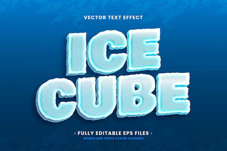

About Ice Cube Font
I came across Ice Cube Font while looking for a clean but slightly sharp typeface for a digital poster. I wanted something that felt cool and firm, without turning into a loud display font. The name caught my eye first, but the geometry made me stop and look closer.
As I tested it for a layout on Free Fonts Lab, I liked how controlled it felt. The structure looked simple, yet it had enough edge to stand out in a grid-based design. That balance between clarity and character made me curious to see how far I could push it across different sizes and formats.
Font Style & Design Analysis
Ice Cube Font is a sans-serif typeface with a crisp, almost chilled visual tone. The strokes feel straight and tidy, with very little fuss or decoration. It leans towards a geometric style, but it does not feel cold in a harsh way. Instead, it gives a steady, organised presence on the page.
The designer is unknown, at least from what I could confirm through regular research and testing sources. That does limit how much background story I can share, which I usually enjoy as part of a font family’s identity. Still, the design stands on its own, and I judged it purely from its performance in real layouts.
The letterforms are compact with a firm vertical rhythm, which helps build clean, aligned typography. Spacing feels slightly tight by default, especially in uppercase, so I often add a touch of tracking for headings. The mood is cool and modern, but not playful. Its strength lies in simple, direct messaging; its limitation appears when a project needs warmth or high readability in very dense text. As a sans-serif, it works best when you let it breathe.
Where Can You Use Ice Cube Font?
I found Ice Cube Font most effective in digital posters, hero headlines, and UI titles. At larger sizes, its clean lines and sharp corners feel clear and confident. It suits tech, gaming, and modern lifestyle brands that want a cool, structured visual identity without heavy decorative styling.
In smaller sizes, it remains readable, but I would not use it for long paragraphs or body copy. The tight spacing and firm geometry can tire the eye when text blocks become heavy. For interfaces or captions, it works well if you increase line height and give each line enough breathing room in the layout.
When pairing it, I like matching this sans-serif with a softer serif or a humanist typeface for body text. That mix keeps the hierarchy clear and adds contrast in tone. In branding systems, I would keep Ice Cube Font for logos, main headings, and key labels, then support it with a more neutral companion for everyday reading.
Font License
The licence for Ice Cube Font can vary depending on where you download it. Some sources may allow personal use only, while others might permit commercial projects. I always recommend checking the official licence text before using it for client work or branding to avoid legal issues later.
My personal takeaway as Ayan Farabi: I reach for this font when I need a cool, controlled voice that stays clear but distinct. It is not a do-everything workhorse, yet in the right context, it delivers a precise, modern look without shouting for attention.


Leave a Reply