
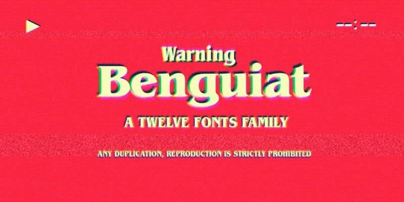

About Itc Benguiat Font
I first reached for Itc Benguiat Font when a client asked for a book cover with a strange, nostalgic mood. I needed something classic, but not stiff. Familiar, yet a bit eerie. This serif typeface kept coming to mind, so I decided to test it in a full layout.
As I worked, the font’s personality became clear very quickly. The curves felt warm, but the sharp details added mystery. I later wrote about the project for Free Fonts Lab, because this design behaved very differently from more neutral book faces I often use.
Font Style & Design Analysis
Itc Benguiat Font is a serif typeface with a strong, story-driven look. The letterforms feel old-world, yet stylised, almost like titles from vintage fantasy novels. Thick and thin strokes shift in a very dramatic way, which gives the font family a theatrical, almost cinematic presence on the page.
The typeface was designed by Ed Benguiat and released through ITC (International Typeface Corporation). Knowing his work helps the font make sense. He often blended classic book typography with bold display energy. You can feel that mix here: serious foundations, but plenty of personal flair in every curve and terminal.
Visually, the letterforms have high contrast, flared serifs, and tight, compact curves. The spacing is fairly snug, especially in uppercase, which creates a dense rhythm in headlines. It shines in short titles and logos but feels heavy in long text. The mood leans dramatic, mysterious, and slightly retro. It is not a quiet workhorse serif, but a character piece best used with intention.
Where Can You Use Itc Benguiat Font?
In my own projects, Itc Benguiat Font has worked best in display roles. Think book covers, chapter titles, film posters, and game branding. At large sizes, every serif, curve, and spur becomes part of the visual identity. The font style draws the eye and quickly sets a tone of suspense or adventure.
At medium sizes, such as pull quotes, menus, or section headers, it still holds up well. You just need to give it space to breathe, with generous line spacing and margins. I often pair it with a clean sans-serif for body copy, so the dramatic headings have support from a calm, readable partner.
For small text, especially long paragraphs, I avoid this serif typeface. The contrast and ornate details can feel busy at small sizes. It suits audiences who enjoy fantasy, horror, mystery, or period themes. If your project needs a font that tells a story before the words do, this one can be very effective in the right layout.
Font License
The licensing for Itc Benguiat Font can vary by source and format. Always check the official vendor or foundry for current terms. Make sure you confirm what is allowed for personal projects, commercial work, desktop use, and web embedding before you commit it to a client job. My own rule is to double-check before final export.
For me, Itc Benguiat works best as a mood-setting tool, not a default choice. When a project needs that specific mix of drama and nostalgia, I know exactly where to reach.


Leave a Reply