

About Lake Font
I first tried Lake Font while building a bold headline system for a small event poster. I needed a display typeface that felt strong but not harsh, something that could grab attention without shouting. The name caught my eye, but the shapes kept me testing it for longer than planned.
As I explored it for Free Fonts Lab, I liked how direct the forms felt. The font style has a clear voice, with a solid graphic presence that stands out in simple layouts. I wanted to see how far I could push it in real projects, from tight grids to more playful compositions.
Font Style & Design Analysis
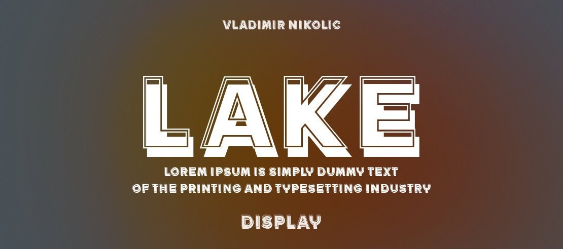
Lake Font is a display typeface, and it behaves exactly like one in how it occupies space. The letters look built for impact, with a strong focus on large sizes and bold statements. This font family leans towards blocky shapes and clear silhouettes, which makes the typography feel structured and controlled.
The designer is unknown, and that always makes me pay extra attention to the details. Without a famous name behind it, the letterforms must speak for themselves. In this case, they do. The design choices show a clear understanding of visual identity needs, especially for headings and logos.
Most characters sit quite upright, with consistent stroke weight and tight geometry. The spacing is slightly firm, which helps headlines feel compact and powerful but can look cramped if you push it too far. The rhythm is steady, so words form strong blocks of tone. Its strengths live in clarity and presence, while its limitation is subtlety; it is not a quiet or delicate font style.
Where Can You Use Lake Font?
Lake Font works best where you want focus and punch. I would reach for it in posters, banners, and bold website hero sections. At large sizes, the display structure holds up well, and every letterform looks deliberate. It can anchor a layout when you keep supporting text more neutral.
For branding, it suits projects that need a confident, modern voice: tech events, streetwear labels, local festivals, or music graphics. I see it pairing nicely with a clean sans-serif for body copy, to balance its weighty mood. Used as a primary headline typeface, it can shape a clear visual identity for youth and lifestyle audiences.
At smaller sizes, Lake Font starts to lose some clarity, especially in dense blocks of copy. I would avoid it for long text or detailed UI elements. Instead, reserve it for titles, callouts, and short phrases. With careful tracking and generous margins, it can turn simple layouts into striking compositions without feeling gimmicky.
Font License
I always recommend checking the latest licence details from the official source before using Lake Font. Terms for personal and commercial work can change, and it is risky to assume anything. If you plan to use it in client projects or branding, confirm that the licence clearly covers that scope.
My honest takeaway as Ayan Farabi: Lake Font is a solid choice when you need a clear, bold display voice and you are ready to give it space to breathe.


Leave a Reply