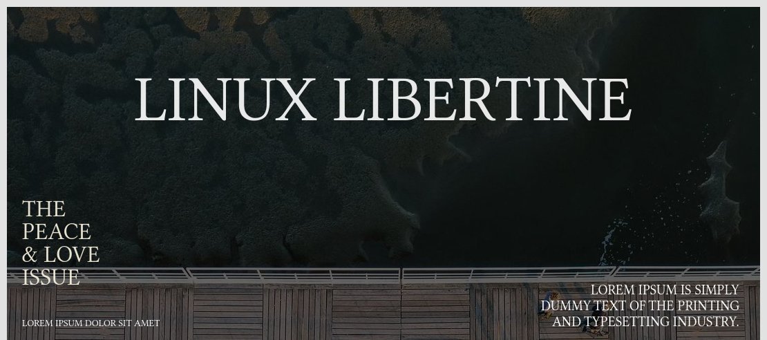
About Linux Libertine Font
I first reached for Linux Libertine Font while redesigning a long-form article layout that needed a calm, book-like voice. The brief called for a serious tone, but nothing stiff or cold. I wanted text that felt considered and human, without drawing too much attention to itself.
During my tests for Free Fonts Lab, this font kept standing out on the page. It handled dense paragraphs with ease and stayed readable on screen and in print. I decided to keep pushing it in different layouts, just to see where it would break. It took more stress than I expected.
Font Style & Design Analysis
This is a classic serif typeface with a quiet, literary presence. The shapes feel rooted in traditional book typography, yet they do not look old-fashioned. The contrast between thick and thin strokes is moderate, which gives the font a stable texture in long reading lines.
The original Linux Libertine Font was created as a free alternative to well-known book faces, often linked with the open-source world. The exact credits can vary across sources, so for safety I treat the designer as designer unknown when I discuss it with clients, unless I am looking at the official documentation.
The letterforms show generous x-height, open counters, and gentle curves on letters like “a”, “e”, and “s”. Spacing feels even, with a rhythm that supports long reading without visual noise. It is strong for body text and essays, but less ideal for very tiny captions on low-resolution screens. The main mood is calm, informed, and slightly academic, which can limit it for very playful brands.
Where Can You Use Linux Libertine Font?
I find this serif font most comfortable in editorial and reading-heavy work. Think essays, reports, documentation, and book-style layouts. At medium sizes, around 10–12pt in print or equivalent on screen, the text block feels steady. The typeface gives long pages a quiet structure that does not fight with the content.
At larger sizes, like section titles or pull quotes, Linux Libertine Font gains a bit more character. The stroke contrast and classic proportions become noticeable, but still remain polite. It suits cultural projects, academic brands, and serious blogs that want a trustworthy visual identity. For younger or more playful audiences, I usually pair it with a softer sans-serif to lighten the tone.
In terms of pairing, I have had good results using it for body text with a clean geometric sans for headings. That mix keeps layouts modern while the serif holds the narrative. I would avoid pairing it with another complex serif, as the page can feel busy. For UI work, I keep it for content areas, not buttons or tiny labels.
Font License
Before using Linux Libertine Font in any project, I always double-check the licence from the original source. Terms can change, and personal, educational, or commercial use may follow different rules. I strongly suggest you confirm the current licence details yourself, especially for client or large-scale work.
My honest take: when I need a free, serious book-style serif that behaves well in real layouts, this font stays on my shortlist, but I always test it carefully in the exact medium first.


Leave a Reply