
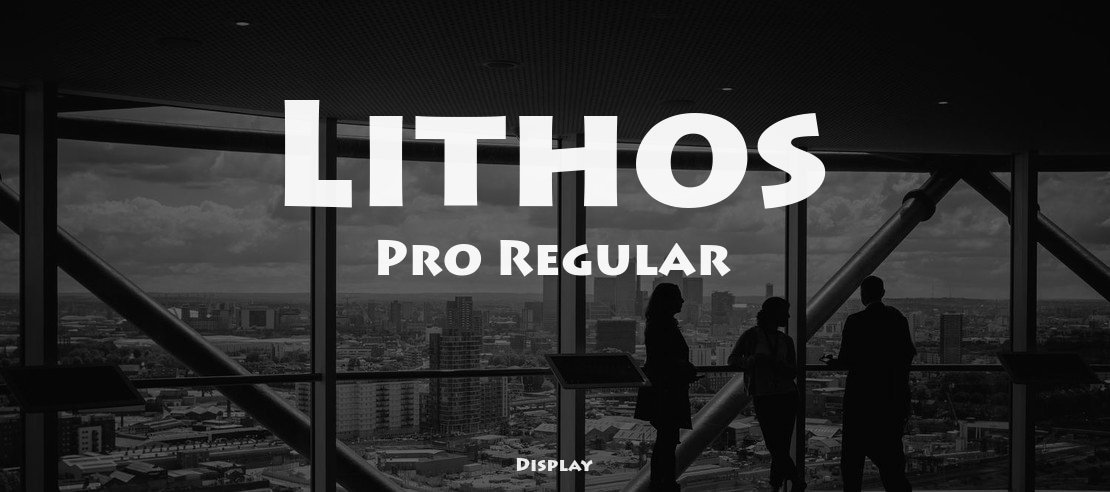

About Lithos Font
I first reached for Lithos Font while working on a poster that needed a bold, carved-stone feeling. The client wanted something strong but not harsh, almost like letters cut into an old temple wall. I remembered seeing this typeface many times before, yet never used it in a full layout.
That project gave me a reason to test it deeply for Free Fonts Lab. I wanted to see how this font behaved beyond a logo mock-up or a single word. As I tried it across headings, short taglines, and simple icons, I started to notice both its charm and its limits.
Font Style & Design Analysis
Lithos Font sits clearly in the display category, and it shows that from the first large word you set. The design feels like stone carving translated into digital type, with solid shapes and a slightly primitive voice. It does not try to be subtle. It wants attention and a strong visual identity.
The font was designed by Carol Twombly for Adobe, and you can feel that careful historical research in every curve. It takes ideas from ancient Greek inscriptions, but turns them into a clean, modern typeface. So it is not a strict copy of classical letters, but more of a respectful, stylised echo.
The letterforms are wide, with almost monoline strokes and clear geometric logic. The spacing feels tight at large sizes, which helps create solid word shapes on posters and covers. The rhythm is blocky and firm, which gives strong impact but little softness. As a display font family, it shines in short texts and logos, yet struggles in long copy. Diacritics and symbols are handled well, but the all-caps nature and tone limit how flexible it can be.
Where Can You Use Lithos Font?
I find Lithos Font works best in big, bold settings where you need drama and weight. Think movie posters, museum banners, game titles, book covers, or themed restaurant branding. At large sizes, the carved-stone feeling really comes alive, and the texture of the shapes helps the design stand out right away.
In smaller sizes, especially below medium body text, the font starts to lose clarity and character. Because it is all caps with strong forms, it can look crowded and tiring if you use it for paragraphs. I usually keep it for headlines, pull quotes, menu section titles, or short labels. For longer text, I pair it with a calm serif or a clean sans-serif font style.
For visual identity work, I reach for this typeface when a brand wants a historic, mythical, or adventure tone. It suits travel, archaeology, history, and fantasy themes quite well, but also some bold lifestyle brands. When pairing, I often let Lithos Font handle the logo or main heading, while a neutral companion font family manages menus, captions, and digital interfaces.
Font License
The licence for Lithos Font can change depending on where you get it and how you plan to use it. Always check the official source for clear terms on personal and commercial projects. I strongly recommend reading the licence carefully before using it in client work or large branding systems.
My honest takeaway as Ayan Farabi: I use this font when I need a bold, carved voice, but I keep it short and focused so its power does not turn into noise.


Leave a Reply