
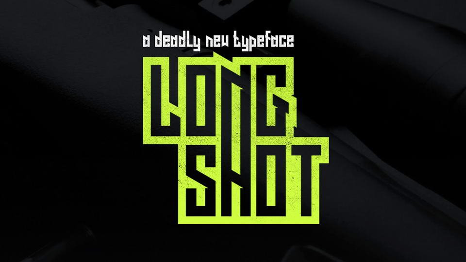

About Long Shot Font
I first tried Long Shot Font while working on a bold poster series for a local event. I needed something loud, clear, and a bit dramatic, but not messy or hard to read. This typeface caught my eye because it pushed attention forward without feeling cheap or overdone.
On Free Fonts Lab, I often test many loud styles, but this one stayed with me. The strong shapes and simple structure made layout decisions easier. I wanted to see how it behaved across different sizes and colours, so I placed it into headers, hero images, and a few social graphics to judge its real-world performance.
Font Style & Design Analysis
Long Shot Font is a pure display typeface, built to shout rather than whisper. The font style leans on thick strokes, tight forms, and a clear, blocky presence. It feels like it was drawn with impact in mind, almost like a poster headline frozen in a single loud moment.
The designer is unknown, which sometimes makes expectations lower, but here the craft feels considered. The font family seems focused on a single weight and style, not a huge system. That keeps it simple to use, but also means I treat it like a tool for special scenes, not a full brand workhorse.
The letterforms are wide and confident, with sturdy verticals and slightly compressed curves that keep words compact. Spacing is fairly tight by default, so I often open the tracking a little for big titles. The rhythm works best in short phrases. It sets a bold, direct mood, but long paragraphs look heavy and tiring. As a display design, it shines in punchy lines, yet struggles when you push it into dense text blocks or tiny captions.
Where Can You Use Long Shot Font?
I see Long Shot Font working best in posters, covers, and bold social graphics. At large sizes, its chunky shapes and simple geometry hold up very well. Headlines, event titles, product names, or short taglines all benefit from its strong presence. It talks loud, so it suits youth, sports, streetwear, or entertainment projects.
At medium sizes, like web headers or card titles, it still reads fine, but you must watch line spacing. If lines sit too close, the heavy forms can feel cramped. I usually pair it with a clean sans-serif or a light serif body typeface, letting Long Shot handle the punch while the companion font carries longer copy.
At small sizes, details merge and counters start to close, so I avoid it for body text, UI labels, or long menus. Think of it as a spotlight tool: use it for logos, badges, banners, or hero sections where the message is short and strong. When used with enough white space and a calmer supporting font, it helps create a clear visual identity without much effort.
Font License
Before using Long Shot Font in client work or commercial projects, always check the official licence details from the original source. Terms for personal and commercial use can change, and some free downloads come with limits. I always review the current licence text to stay safe and keep client work compliant.
For me, Long Shot Font is a solid choice when I need a bold, no-nonsense headline that grabs attention fast and stays readable.


Leave a Reply