
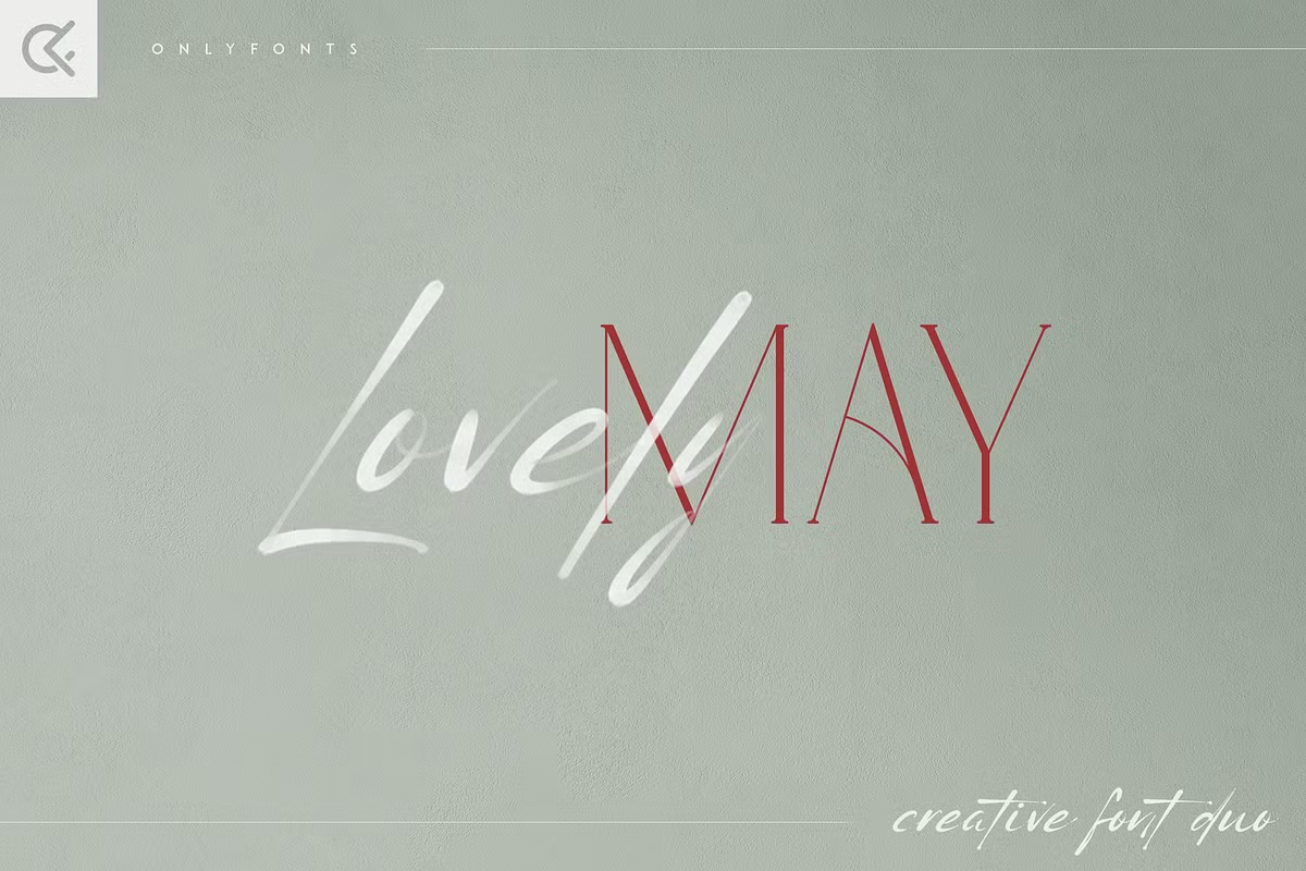

About Lovely May Font
My first reaction to Lovely May Font was simple: it feels soft, warm, and a little romantic. The curves are gentle and friendly, and the whole typeface gives off a relaxed, handwritten mood. I was curious how this charm would hold up in real layouts, not just in preview images.
What pulled me in most was the way the letters seem natural without looking messy. I decided to test it for a small brand concept on Free Fonts Lab and a few social media templates. I wanted to see if this script style could work beyond a cute logo and still feel clear, balanced, and readable.
Font Style & Design Analysis
From my experience, this is a script, handwritten font style with a clear romantic direction. The strokes feel like quick pen movements, but the structure stays controlled. It sits nicely between casual and elegant, which makes it feel approachable instead of stiff or formal. That balance is what gives it real design value.
The exact creator of this font was not clearly stated in the resources I checked, so I will treat it as designer unknown. That lack of information does not change how the letters behave on screen or in print, but it matters when you think about licensing, brand work, and long-term use in a visual identity.
Looking closely at the letterforms, I notice rounded shapes, soft loops, and a light bounce along the baseline. The spacing is fairly tight, which adds charm in big headings but can feel crowded in long lines of text. It shines in short words and names, where the rhythm and flow feel personal. For longer paragraphs, the playful strokes can start to hurt quick reading.
Where Can You Use Lovely May Font?
In real projects, I see Lovely May Font working best in display roles, not as a text workhorse. It looks strong on logo concepts for lifestyle, handmade goods, or beauty brands. I also like it for short quotes, highlight words, or name marks on packaging where you want a soft, human touch.
At large sizes, on posters, social posts, or website hero images, the script forms stay clear and charming. The small details in each curve become a feature instead of a problem. At small sizes, though, the loops and joins can blur together, especially on screens. For body text or long captions, I would always switch to a clean sans-serif or simple serif partner.
When I pair this font, I prefer matching it with a neutral, modern font family that lets the script do the talking. A tidy sans-serif in all caps under a Lovely May heading works very well for balance. Careful line spacing and short word groups help keep the handwritten energy readable while still feeling personal and warm.
Font License
From what I could find, licence terms for this font were not fully clear. I would only feel safe using it freely for personal work, tests, or mock-ups. For any client project or commercial use, you should always check the official licence details from the original source and keep a record.
After testing it in real layouts, my honest view as Ayan Farabi is simple: use this font when you want gentle, handwritten emotion in short bursts, then support it with a clear, calm partner typeface so the message always stays easy to read.


Leave a Reply