
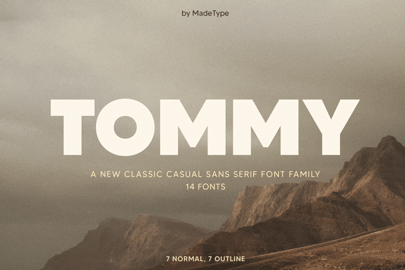

About Made Tommy Font
I first picked up Made Tommy Font while working on a clean brand refresh for a tech start-up. They wanted something modern, but not cold or harsh. I needed a typeface that felt simple, clear, and slightly friendly, without turning playful or childish.
Made Tommy Font kept showing up in my research on Free Fonts Lab, so I decided to test it across a few layouts. I tried it in logos, app screens, and slide decks. After a few rounds, I began to see where this font family shines and where it needs more careful use.
Font Style & Design Analysis
Made Tommy Font is a sans-serif typeface with a clean, geometric core. The shapes feel tidy and steady, with rounded corners that soften the look a little. It aims for a modern, minimal style that sits somewhere between strict corporate and relaxed lifestyle branding.
The exact designer is unknown, at least from what I could confirm through normal research channels. That said, the font style suggests a strong interest in simple grids and modular forms. The family structure seems planned with digital use in mind, rather than classic print publishing.
The letterforms are quite even, with open counters and a stable rhythm from line to line. Spacing is on the tighter side, which works well for headlines but needs tracking adjustment for body text. The mood is calm and contemporary, but it can feel a bit neutral if you rely on it alone. As a sans-serif font family, it handles UI, headings, and short blocks well, but very long reading text may feel slightly stiff without generous spacing.
Where Can You Use Made Tommy Font?
In my own work, Made Tommy Font performed best in digital products and brand systems. It reads clearly in app interfaces, dashboards, and web headers. At larger sizes, the geometry becomes a visual feature, giving logos and hero text a smooth and confident feel.
At smaller sizes, the font stays legible, but it needs enough line height and a bit of extra letter spacing. For long paragraphs, I often pair it with a softer serif typeface. That mix gives a nicer reading flow while keeping Made Tommy Font for titles, menus, and key labels.
This sans-serif works well for tech brands, agencies, portfolios, and lifestyle products that want a clean, modern voice. It also suits pitch decks, posters, and social graphics where consistency matters. With careful hierarchy and pairing, it can support a full visual identity without feeling too mechanical.
Font License
Before you use Made Tommy Font in any client or commercial project, always check the official licence details from the original source. Some versions allow personal use only, while others may need a paid or extended licence. I always confirm terms in writing to keep both myself and my clients safe.
For me, Made Tommy Font is a solid, modern choice when I want clarity and order without hard edges. It rewards careful spacing and good pairing, and when handled with intention, it can give a brand a calm, confident voice.


Leave a Reply