
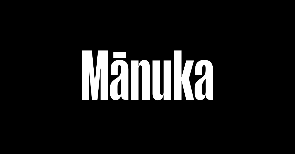

About Manuka Font
I came across Manuka Font while searching for a clean yet bold typeface for a product mock-up. The project needed strong headlines that still felt friendly and modern. I tested it on packaging layouts, social posts, and a simple landing page to see how it behaved in real use.
The first thing that caught my eye was its compact shape and confident presence. It looked purposeful without trying too hard. I decided to review it for Free Fonts Lab because it seemed like a solid option for designers who want impact, but not a loud display style.
Font Style & Design Analysis
Manuka Font is a sans-serif typeface with a sturdy, geometric feel. The strokes are firm and even, giving the font family a very controlled look. It sits somewhere between technical and friendly, with enough softness in the curves to keep it from feeling cold or robotic.
The exact designer is designer unknown, which can sometimes make context harder to read. In this case, though, the design direction is clear enough through the letterforms themselves. It feels like a typeface shaped for branding, packaging, and bold editorial work rather than body copy.
The letterforms have tight, compact spacing, which helps create dense, strong blocks of text in headlines. The rhythm feels steady, and the counters stay open enough for quick reading at medium sizes. At very small sizes, the tight spacing can start to feel a bit cramped, so I would not use it for long paragraphs. As a sans-serif, it carries a modern mood with good clarity, but you need to give it space when used alongside lighter fonts.
Where Can You Use Manuka Font?
I found Manuka Font most comfortable in bold titles, product names, and UI labels that need structure. On posters and hero banners, it holds attention easily, especially when you keep lines short and leave plenty of margin. It works well for brands that want a serious but not stiff visual identity.
At large sizes, the shapes look sharp and intentional, so it is great for logos, app icons, and headlines in slide decks. On packaging, it helps give a compact, premium look, especially for tech, sports, or grooming products. At smaller sizes, I prefer using it for short labels or navigation instead of full paragraphs.
For pairings, I had good results matching it with a softer serif for body copy, which balanced its dense structure. A light or regular weight sans from another font family can also soften layouts where Manuka Font is the main display voice. It suits audiences who appreciate clear, modern typography without decorative noise.
Font License
Licensing for Manuka Font can vary depending on where you get it from. Some sources may allow personal use only, while others may include commercial rights. I always recommend checking the official licence details before using it in client work or paid projects.
For me, Manuka Font works best as a focused tool for strong, compact headlines rather than a do-everything typeface. When used with care and enough breathing room, it can add clear structure and quiet confidence to modern layouts.


Leave a Reply