
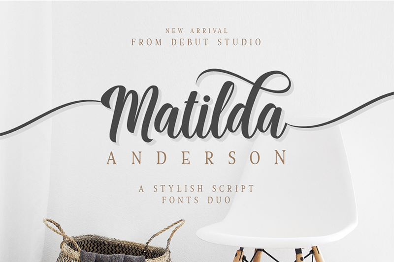

About Matilda Font
I came across Matilda Font while searching for a soft, personal script for a small wedding invite set. I needed something friendly, not too fancy, and easy to read in print. The curves felt calm and a bit nostalgic, so I decided to test it properly on a few layout drafts.
During that test, I tried different paper textures, colour palettes, and text lengths. The font handled names, short quotes, and headings quite well. That first trial led me to explore it further for a review on Free Fonts Lab, because I knew other designers might face the same kind of brief.
Font Style & Design Analysis
Matilda Font is a script typeface with a relaxed, handwritten flow. The strokes feel smooth and rounded, without sharp or aggressive angles. It leans towards a casual, personal look rather than a formal calligraphy style. When I see it in use, it reminds me of neat handwriting on greeting cards or personal letters.
The designer is unknown, at least from the sources I could access while testing the font. That makes it a bit harder to trace its design story, but the intent still feels clear. The font family focuses on one main style, and it seems built for display use more than long reading text, which matches many modern script fonts.
The letterforms show gentle contrast in stroke width, but nothing extreme. Lowercase letters connect in a stable rhythm, so words look smooth and even. Spacing leans slightly tight, which can look good in logos and headings, but needs care in small text. The mood is friendly, informal, and warm. As a script font, it works best at medium to large sizes, because tiny text can lose detail and legibility quite quickly.
Where Can You Use Matilda Font?
I find Matilda Font most useful in projects that need a personal, human touch. Wedding stationery, baby announcements, simple brand marks, and quote graphics all suit its character. It speaks gently, so it fits lifestyle brands, small cafés, craft products, or social media posts aimed at a warm, casual audience.
At larger sizes, like titles, logos, or packaging labels, the script style feels clear and inviting. The curves show nicely on posters and hero images. At smaller sizes, especially below 12 pt, the joins between letters can start to close up. For that reason, I avoid using it for body text or long paragraphs and keep it for short lines and accents.
When pairing it with other fonts, I usually match Matilda Font with a simple sans-serif or a very clean serif. This keeps the layout balanced and stops the page from feeling busy. I let Matilda handle names, headings, or key phrases, while the supporting font carries all the functional content. This approach keeps the visual identity both expressive and clear.
Font License
The licence for Matilda Font can vary depending on where you download it from. Some sources may allow personal use only, while others might offer commercial options. I always check the current licence details on the official source before using it in client work or paid projects.
My personal takeaway as Ayan Farabi: Matilda Font is a gentle, approachable script that works best when you give it space and a clear role. If you treat it as a character font for short, meaningful text, it can add a nice human note without overpowering your design.


Leave a Reply