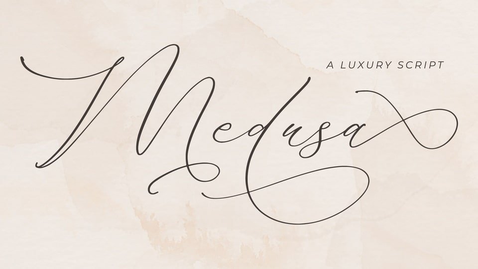
About Medusa Font
I first tried the Medusa Font while working on a small packaging concept for a handmade beauty brand. The client wanted a dramatic, flowing script that felt a bit mystical but still easy to read. I was looking through several script options on Free Fonts Lab, and this one caught my eye quickly.
The curves felt bold but not messy, and the overall font style had a clear sense of drama. I decided to test it in logo sketches, product labels, and a few social media mockups. That first round showed me both its charm and its limits, which made the test very interesting from a typography point of view.
Font Style & Design Analysis
The Medusa Font is a script typeface with a strong, sweeping motion in its letterforms. Each stroke feels deliberate, with thick curves and sharp turns that create a bold rhythm. It leans more towards a decorative script than an everyday handwriting style, so it carries a clear visual identity right away.
The designer of this font is designer unknown, at least from the sources I could access. Without a clear foundry name, I rely more on how the font behaves in layouts than on brand reputation. The build quality feels decent for a free script font, though you can see small rough edges when you push it into more demanding compositions.
The letterforms are wide, with generous loops and tails, especially on capitals and descenders. Spacing is fairly tight by default, which adds drama but can cause clashes in certain pairs, especially when you type in all caps. The rhythm works well for short words or names, but longer lines start to look busy. As a script font family, it shines in large display sizes, while fine detail and subtlety are not its strongest points.
Where Can You Use Medusa Font?
In my tests, the Medusa Font worked best in logo marks, short headlines, and hero text where you only use a few words. It suits beauty brands, fashion tags, perfume labels, and anything that needs a sense of mystery or elegance with a slight edge. It does not feel playful; it leans more dramatic and bold.
At large sizes, the curves and flourishes read clearly and add strong personality to your typography. On small labels or body text, the strokes start to crowd together, and legibility drops fast. I would avoid using it for long quotes, menus, or any small paragraph work. Pair it with a clean sans-serif for body copy so the script style has room to breathe.
For social media graphics, posters, and event titles, it can give a strong focal point when used as a single striking word or phrase. I also tried it on mock book covers and album art, where it worked nicely as a central wordmark. When you balance it with simple layouts, minimal colour, and plenty of negative space, the font style feels intentional rather than overwhelming.
Font License
The licensing for the Medusa Font may vary depending on where you download it. Some sources allow personal use, while commercial use may need a separate licence or permission. I always suggest checking the current licence details on the original source before using it in client or paid projects.
For me as a designer, this is a font I reach for when I need a bold, dramatic script for short, impactful words, not a general-purpose workhorse. Used with care and the right pairing, it can add a strong, memorable touch to a visual identity.


Leave a Reply