

About Mikado Font
I first picked up Mikado Font for a playful children’s book cover. The brief needed something bold, friendly, and easy to read. I wanted a typeface that felt energetic but not messy. Many options looked either too serious or too cartoonish, so I kept searching.
When I tested this font in my mockups, the shapes clicked right away. The chunky strokes and soft curves gave the artwork a warm, fun voice. I later wrote some notes about it for Free Fonts Lab, because it behaved differently from many other bold display faces I had used.
Font Style & Design Analysis
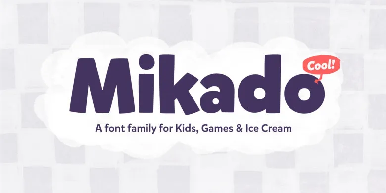
Mikado Font is a display typeface with a lively, rounded look. The letters are thick and compact, which makes each word feel like a solid block of colour. There is a strong sense of play, but the forms still feel carefully drawn and controlled, not random or chaotic.
The exact creator of this font is not clearly documented, so the designer is unknown. That said, the font family shows a clear design system. The stroke weight stays quite even, and the curves feel deliberate. Someone obviously paid attention to how the letters sit together and how they appear in short, loud phrases.
The letterforms have wide counters and soft corners, giving the typeface a friendly tone. Spacing is tight by default, which works well for headlines, banners, and logos. In longer words, the visual rhythm stays bouncy and dense. This is a strength for branding and posters, but it can feel heavy in long text lines. As a display font, it shines in short bursts, not in body copy.
Where Can You Use Mikado Font?
I find Mikado Font most effective in projects that target kids, families, or casual audiences. It works nicely on packaging for snacks, toys, or small lifestyle products. When used in big sizes, the round shapes feel inviting and fun. The bold style also helps it stand out in busy layouts.
On posters, book covers, and social graphics, this typeface can carry a whole visual identity by itself. I usually pair it with a clean sans-serif for small text to keep balance. The contrast between the playful headline and simple supporting typography helps the design stay clear and readable on both print and screen.
At small sizes, the thick strokes can crowd details, so I avoid it for long paragraphs or captions. Instead, I use it for titles, badges, and short taglines. It also works well in logo sketches where you want a friendly, chunky wordmark. For user interfaces or anything data-heavy, though, I switch to lighter, calmer fonts.
Font License
Before using Mikado Font in client or commercial work, I always double-check the licence terms from the official source. Permissions for personal use, printing, or digital products can change over time, so it is safest to confirm current rules and keep a record.
My honest take: this font is a strong choice when you need bold, playful energy in short, clear messages, as long as you keep it away from long reading text.


Leave a Reply