

About Modak Font
I came across Modak Font while searching for a loud, playful style for a kids’ event poster. I wanted something that felt fun, chunky, and full of character, without looking cheap or rushed. Many bold fonts tried too hard, but this one stood out because it looked joyful and confident.
I first tested it on a bright poster design and a simple social media graphic for a mock project at Free Fonts Lab. The shapes held their charm at large sizes and kept the mood light. That early test made me curious to explore how far I could push this font family in real layouts.
Font Style & Design Analysis
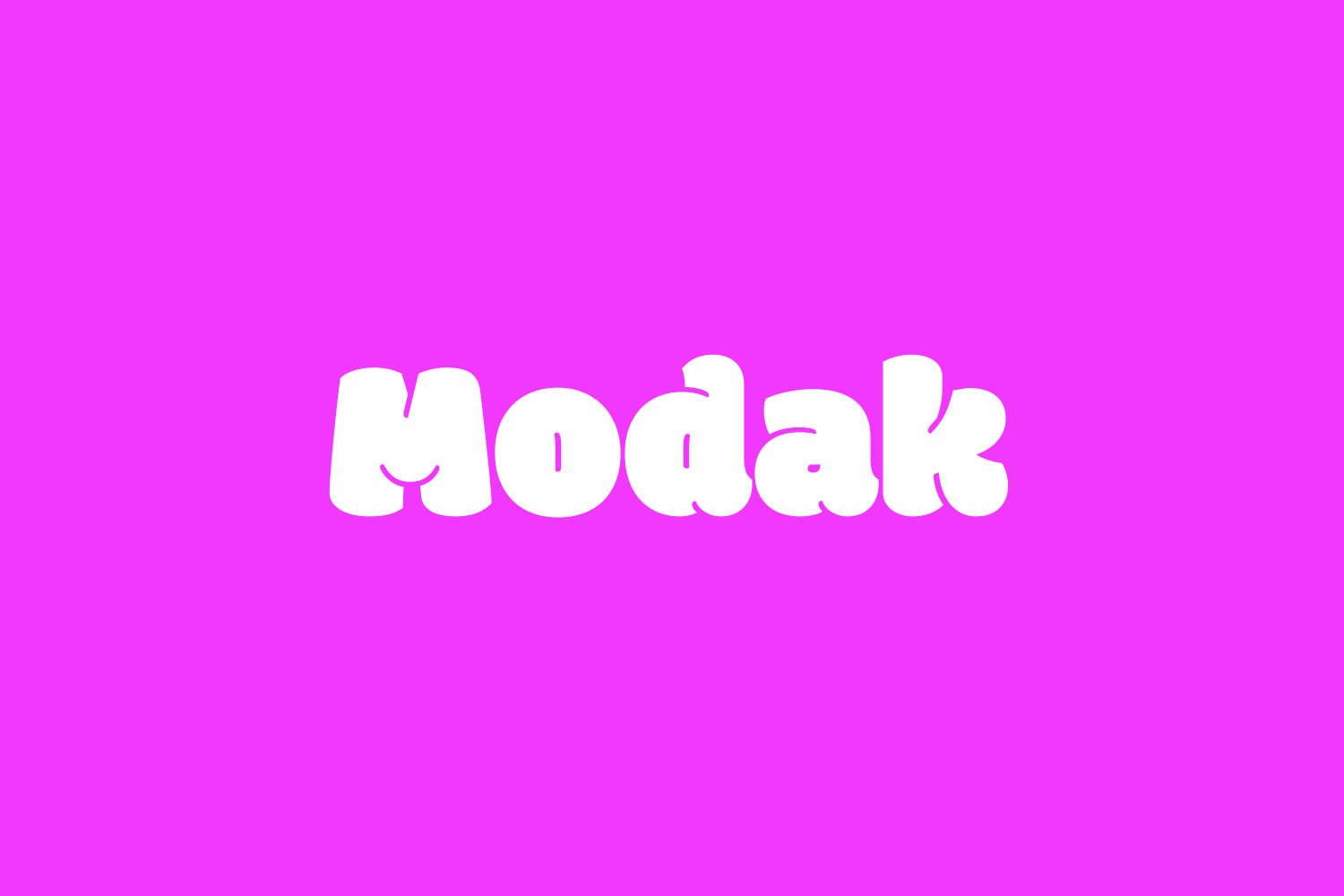
Modak Font is a pure display typeface, and it acts exactly like one. The letters are extremely heavy, rounded, and almost cartoon-like. Each letterform feels like it is made of soft dough, with big curves and smooth edges. It grabs attention instantly and fills space with a bold, friendly voice.
The designer of this font is widely credited as Ek Type, a respected Indian type foundry, so the designer is not unknown. Their work often leans into strong visual character and regional flavour, and you can feel that here too. The personality is playful but still carefully drawn, not random or messy.
When I look closely at the letterforms, I see tight counters, very low contrast, and thick strokes everywhere. Spacing is compact, so words form dense, rounded blocks. This creates a strong rhythm, but it can feel heavy in long lines. It shines in short headlines, logos, and single words. For longer text, the weight and tight spacing become a real limitation, especially at small sizes.
Where Can You Use Modak Font?
I treat Modak Font as a special tool for loud, happy design work. It works very well for children’s brands, food packaging, festival posters, and fun product labels. When I used it in a sweets-themed concept, the type instantly suggested softness and sweetness, almost like candy or dough.
At large sizes, this display font performs strongly. The chunky shapes stay clean and readable on posters, banners, thumbnails, and bold social media graphics. At smaller sizes, though, the tight counters start to close up. On mobile screens, I avoid using it for longer phrases below headline size, because it can blur into solid shapes.
I usually pair it with a simple sans-serif or light serif for body copy and supporting details. Something neutral keeps the visual identity balanced and stops the layout from feeling too heavy. I also give the letters extra spacing when needed, especially in logos or wordmarks. With enough white space around it, the font style feels playful rather than cramped, which suits young audiences and casual brands very well.
Font License
From what I know, Modak Font is often shared as a free typeface, but licence terms can change. I never assume usage rights, especially for commercial work. Before you use it for clients, packaging, or large campaigns, please check the current licence on the official source and confirm what is allowed.
For me, Modak works best as a bold, occasional voice when a project needs warmth, weight, and a bit of playful drama.


Leave a Reply