
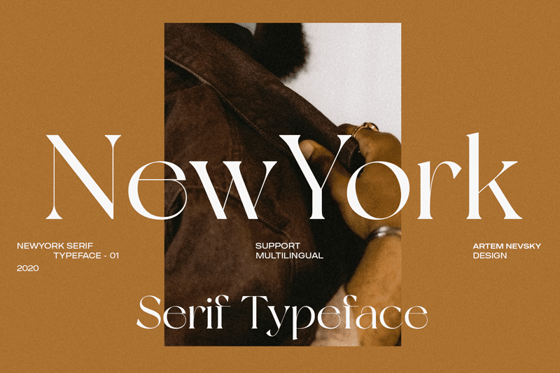

About New York Font
I ran into New York Font while comparing serif options for a calm editorial layout. I needed a font that felt classic, but not stiff or old. This one caught my eye because the shapes looked familiar yet slightly sharpened, like a modern take on a book face.
I decided to test it in a long-form article mockup for Free Fonts Lab. I wanted to see if the rhythm worked over many paragraphs and pull quotes. My goal was simple: find out if this typeface could support serious content while still feeling warm and human.
Font Style & Design Analysis
New York Font is a serif typeface with a clear editorial voice. The capitals stand tall and confident, while the lowercase letters feel more relaxed and readable. The contrast between thick and thin strokes is present, but not extreme, which keeps the font style elegant without turning fragile or fussy on screen.
The designer is unknown, at least from the sources I could check with care. Because of that, I focused more on how the font family behaves in real layouts than on its history. The design direction seems influenced by classic newspaper and magazine typography, with a slight digital polish that makes it feel current.
When I look closely at the letterforms, I notice a firm vertical stress, sturdy serifs, and open counters. The spacing feels moderate, not too tight, so text breathes nicely in longer lines. It holds texture well in paragraphs and gives a steady reading rhythm. The mood leans serious and thoughtful, better for calm, informed voices than playful branding. Its limits appear in ultra-small sizes and very bold, loud designs, where it can look a bit reserved.
Where Can You Use New York Font?
I see New York Font working best in editorial and content-heavy projects. Think online magazines, essays, opinion pieces, and blog articles with a mature tone. At medium sizes on screen, it reads smoothly and keeps the eye moving without noise. In print, it would suit brochures, book interiors, and catalogues with structured layouts.
At larger sizes, like headings or pull quotes, the serif details become more expressive. The sharp terminals and clear contrast give titles a quiet authority. I paired it with a clean sans-serif for UI labels and navigation, which helped balance the strong text voice with a lighter, modern touch in the interface elements.
In smaller sizes, such as captions or legal notes, you need to test carefully. The thin parts of the strokes can start to fade on low-resolution screens. For brand systems, I would use this serif as the main text typeface and pair it with a neutral geometric or humanist sans for logos, buttons, and short labels. It suits audiences who value clarity, culture, and a slightly traditional visual identity.
Font License
The licence terms for New York Font can vary depending on where you download it. Do not assume it is free for commercial work, even if it is free to grab. Always read the official licence from the source, and confirm rights for client projects, printing, and web use.
After testing it in real layouts, I see New York Font as a steady, reliable serif that rewards careful, content-focused design.


Leave a Reply