

About Palace Script Font
I first tried Palace Script Font while working on a wedding invite set for a client who wanted something formal, but still romantic. I needed a script that felt classic, with a touch of drama, yet stayed readable on print. This typeface caught my eye because of its long flowing strokes and old-fashioned charm.
As I tested it in different layouts for Free Fonts Lab, I noticed how quickly it set a certain mood. The curves feel elegant but not flashy, and the rhythm of the letters gives a clear sense of occasion. That balance between showy and controlled made me curious to push it in more than one project.
Font Style & Design Analysis
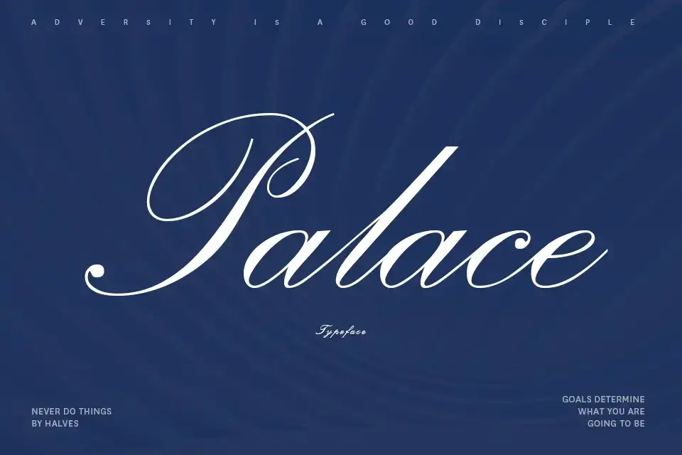
Palace Script Font is a traditional script typeface with very high contrast and sweeping loops. The strokes are thin in many places and then suddenly swell into thick curves. It looks like careful pointed-pen calligraphy, the kind you would see on formal invitations or old certificates.
The exact creator of this font is designer unknown, which is quite common for older digital revivals. Still, the design clearly follows a classic English roundhand style. You can see a strong link to formal copperplate scripts, with polished shapes and a strong sense of slope.
The letterforms of this script font are tightly connected, with tall ascenders and deep descenders that create rich texture. Spacing is close, so words feel like ribbons rather than separate letters. This gives a graceful rhythm but can hurt legibility in long text. It shines in short names, headings, and logos, but struggles in small captions or dense paragraphs.
Where Can You Use Palace Script Font?
I find Palace Script Font works best in projects that need ceremony and tradition. Wedding stationery, formal event invitations, luxury packaging, and certificates all suit this script style very well. When used in large sizes, the dramatic swashes stand out and create an instant sense of prestige.
At smaller sizes, the fine hairlines become hard to read, especially on screen. I avoid using it for body text or long quotes. Instead, I like to pair it with a clean serif or sans serif font family for supporting text. The contrast between simple text and decorative script keeps the layout balanced and easy to scan.
For branding, Palace Script Font can work for high-end boutiques, beauty products, jewellery, or heritage-style logos. It speaks to audiences who enjoy tradition and elegance. I usually limit it to wordmarks, signatures, or short taglines. Used with plenty of white space, it can add drama without overwhelming the overall visual identity.
Font License
The licensing for Palace Script Font can vary between sources, especially since it is an older style script. Before using it in client work or any commercial project, you should carefully read the licence details from the official distributor. I always double-check usage rights for print, web, and logo work to avoid issues later.
For me, Palace Script Font is a tool I reach for when I want a very formal, almost ceremonial voice in my typography. It is not an everyday workhorse, but when the brief calls for tradition and flourish, it earns its spot in my toolkit.


Leave a Reply