

About Perandory Font
I first tried Perandory Font while building a calm, classic cover for a short poetry book. I needed something formal, but not stiff or cold. This serif typeface caught my eye because it felt elegant, yet still easy to read in longer lines of text.
Its shapes looked strong enough for titles, but gentle enough for body copy. That balance made me curious, so I tested it more deeply for Free Fonts Lab. I wanted to see how the font family behaved in real layouts, and if it could handle both print work and simple digital designs without losing clarity.
Font Style & Design Analysis
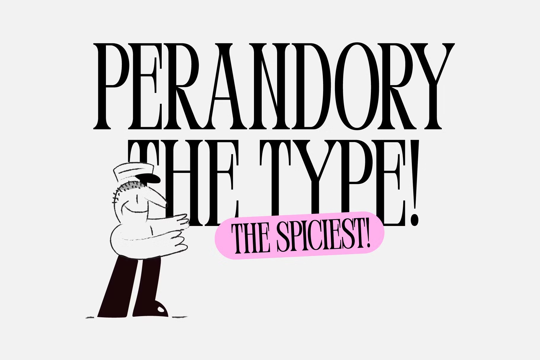
Perandory Font is a serif typeface with a clear, classic voice. The strokes feel tidy and well controlled, with soft contrast between thick and thin parts. The serifs are firm but not too sharp, which gives the font style a polite, literary mood. It leans more refined than playful, but never feels old-fashioned.
The designer of this font is unknown, at least from the sources I checked while testing it. Even so, the work feels careful. The spacing shows that someone thought about legibility and rhythm. It does not look like a quick display experiment. It behaves more like a planned text font that can support long reading.
The letterforms sit on a stable baseline, and the counters stay open, which helps the eye move smoothly along each line. Uppercase letters stand tall and slightly formal, good for headings and book covers. Lowercase shapes are friendly, with enough width so words never feel cramped. Kerning is mostly consistent, though pairs like “Ta” and “To” can look a bit tight at large sizes. The mood is serious but approachable, which is a strength for editorial work. Its main limitation is that it is less suited to very playful brands or loud poster design.
Where Can You Use Perandory Font?
In my own tests, Perandory Font worked best in book covers, chapter titles, and quiet branding systems. It has that steady serif voice that suits literary projects, personal blogs, and thoughtful portfolios. At larger sizes, the serif details feel clean and balanced, which makes it strong for quotes, headlines, and pull-out text in magazines.
At smaller sizes, the open counters and measured spacing keep body text quite readable, especially when you give it enough line height. For long paragraphs, I would avoid very tight tracking. It pairs nicely with a simple sans-serif for UI elements, captions, and menus. When I tested pairings, I liked it alongside plain geometric sans fonts, because they let its classic texture stand out without a fight.
For branding, I see this serif working well for bookshops, cafés, photographers, and personal coaches who want a calm, trusted look. It also suits invitations, certificates, and simple packaging labels where a touch of tradition helps. I would not choose it for loud youth fashion or extreme sports brands. It speaks better to audiences that value clarity, depth, and a slower pace.
Font License
Before you use Perandory Font in any client work or commercial project, please check its current licence on the official source. Terms can change, and personal use does not always cover business use. I always confirm rights and allowed usage each time I install or update a font.
For me, Perandory Font has become a quiet option I reach for when a design needs dignity without drama. It is not flashy, but it earns its place in careful, text-focused projects, which is what I value most as a typographer and designer.


Leave a Reply