
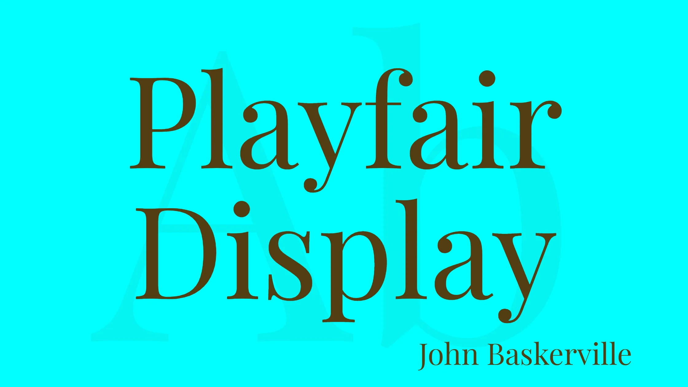


Playfair Display is a widely used font that belongs to the transitional style. In the late 1700s, people switched from using quill pens to using metal pens with pointed tips for writing as part of the European Enlightenment movement. Advancements in printing technology, ink, and paper production allowed for printing letterforms with higher contrast and delicate hairlines that differed from handwriting.
The Playfair Display typeface truly embodies the style of that historical era. This design is not an exact copy of any particular style, but it takes inspiration from John Baskerville’s typography and the sophisticated look of Scotch Roman fonts. As a display font, it is primarily intended for larger sizes, making it suitable for headlines, titles, and other prominent text elements. However, it can also be paired with the versatile and legible Georgia font for body text, creating a harmonious typographic composition.
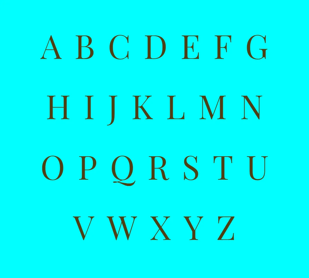
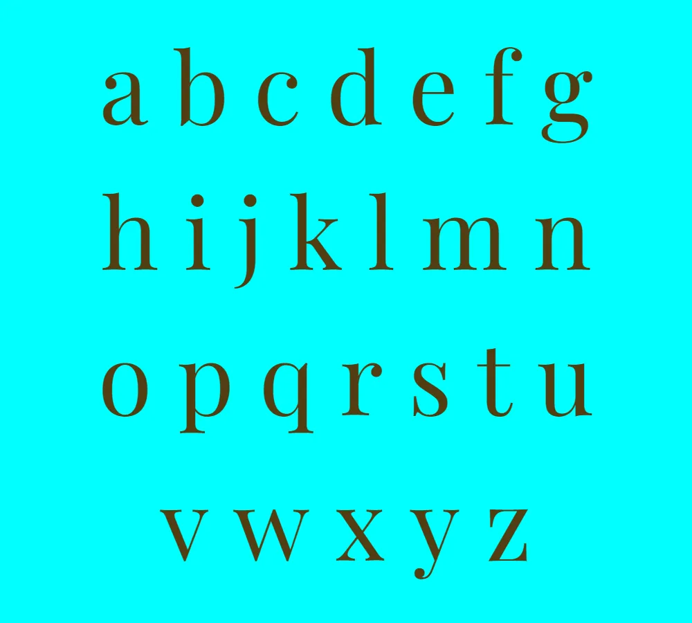
The primary Playfair Display font family consists of several weights and styles, providing flexibility and variety for designers. Additionally, there is a sibling family called Playfair Display SC, which offers small caps as an alternative to the regular uppercase letters. These small caps can add a touch of sophistication and uniqueness to a design.
Claus Eggers Sørensen designed Playfair Display font. With a keen understanding of type design and a meticulous attention to detail, Sørensen crafted a font that combines historical influences with contemporary sensibilities. The result is a timeless typeface that can be used in a wide range of applications, from editorial layouts to branding and advertising.
One of the notable features of Playfair Display is its inclusion of various ligatures. Ligatures are special characters that merge two or more letters into a single glyph, enhancing the visual flow and aesthetics of the text. The font supports both common ligatures and discretionary ligatures, giving designers the freedom to choose the appropriate ligature style based on their specific design needs.
It’s worth mentioning that Playfair Display is available for free for personal use. However, it’s important to review the font’s licensing terms and conditions before using it in commercial projects to ensure compliance with the designer’s requirements.
In conclusion, Playfair Display is a transitional-style font that captures the elegance and sophistication of the European Enlightenment era. With its distinct letterforms, high contrast, and delicate hairlines, it offers a versatile typographic solution for various design applications. Whether used for large headlines or paired with Georgia for body text, Playfair Display brings a touch of timeless beauty to any project.


