
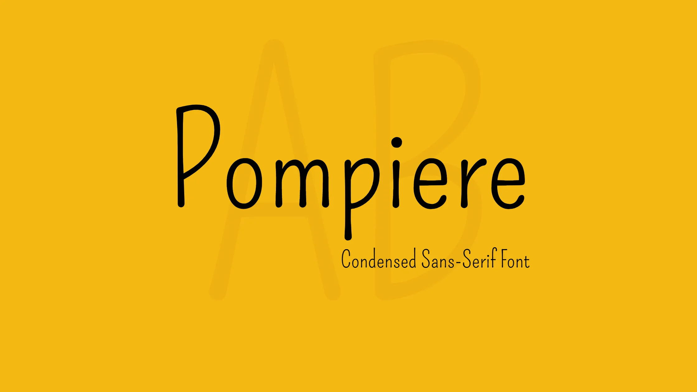


Pompiere font is a unique and delightful typeface that captures attention with its playful and sweet nature. It belongs to the category of low contrast condensed sans serif fonts. However, what sets Pompiere apart from most sans serif fonts is its tall ascenders and incredibly tiny x height. Due to its design characteristics, Pompiere works best at medium to large sizes, allowing its distinct features to shine.
The Pompiere font was created from a handmade sign outside the New York City firefighters’ Squad Co. 18 headquarters. The firehouse is located in the lively West Village neighborhood of Manhattan. The designer of this font was created to resemble a vintage sign, giving off a warm and nostalgic vibe.
The unique combination of a condensed structure, low contrast, tall ascenders, and small x height gives Pompiere font its distinct personality. The condensed nature of the font makes it space-efficient, allowing for effective use of text in various design applications. The low contrast gives it a balanced appearance, ensuring legibility while still maintaining its playful appeal.
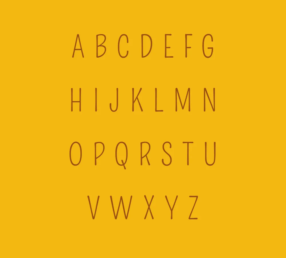
One of the defining characteristics of Pompiere font is its tall ascenders. Ascenders are the parts of the letters that extend above the x height, and in Pompiere, they are notably elongated. This feature adds elegance and a touch of whimsy to the font, making it stand out from other sans serif typefaces. The tall ascenders give Pompiere a sense of verticality, making it particularly suitable for headlines and titles.
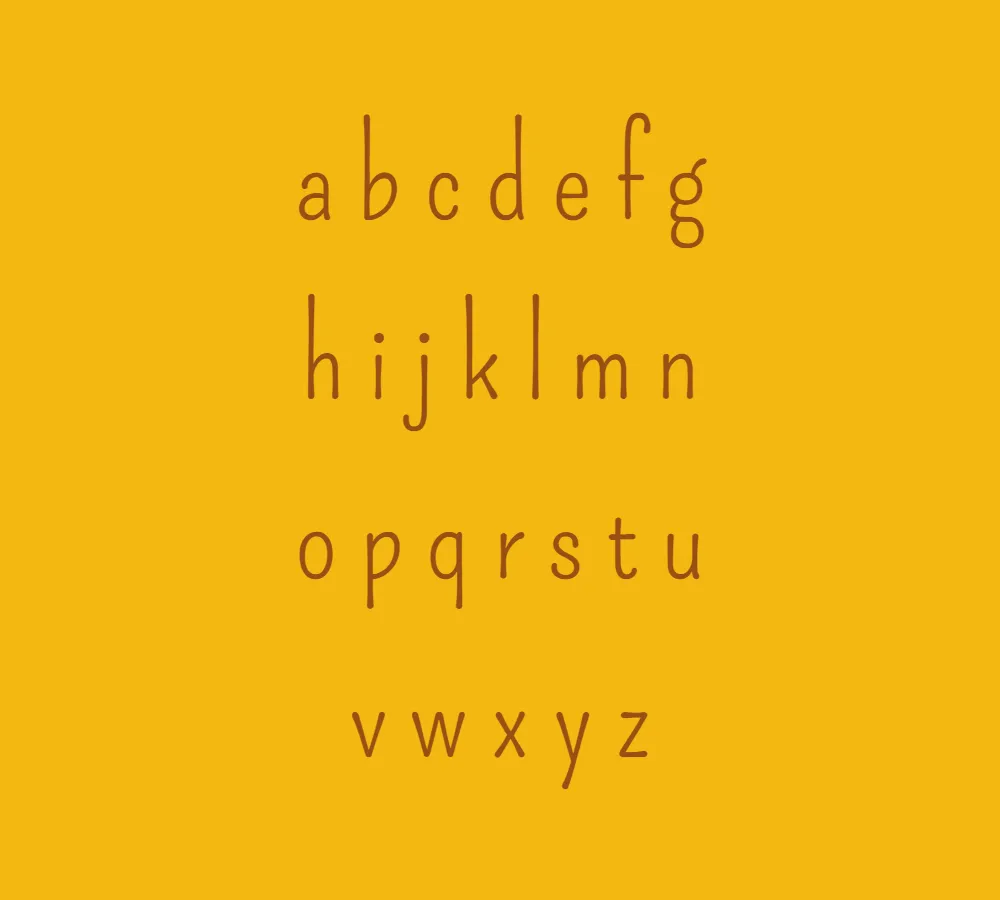
The Pompiere font has tall ascenders but a very small x height. The x height refers to the height of the lowercase “x” in a typeface. With its diminutive x height, Pompiere brings a unique visual balance to the overall design. However, it also means that the font may not be good for small sizes or for dense blocks of text, as it could make it hard to read. Instead, Pompiere font thrives when used at medium to large sizes, allowing its charming details to be fully appreciated.
Pompiere font is available for free for personal use, allowing individuals to incorporate its playful and charismatic style into their personal projects. Whether it’s creating eye-catching posters, designing invitations, or adding a touch of whimsy to digital artworks, Pompiere font offers a versatile and distinctive option.
In conclusion, Pompiere font is a delightful and captivating typeface that stands out with its low contrast condensed structure, tall ascenders, and tiny x height. Inspired by a handmade sign outside the NYC firefighters Squad Co. 18, Pompiere captures the essence of playfulness and charm. Its design makes it best suited for medium to large sizes, allowing its unique features to shine. With its availability as a free font for personal use, Pompiere offers a wonderful option to infuse projects with a touch of whimsy and character.


