
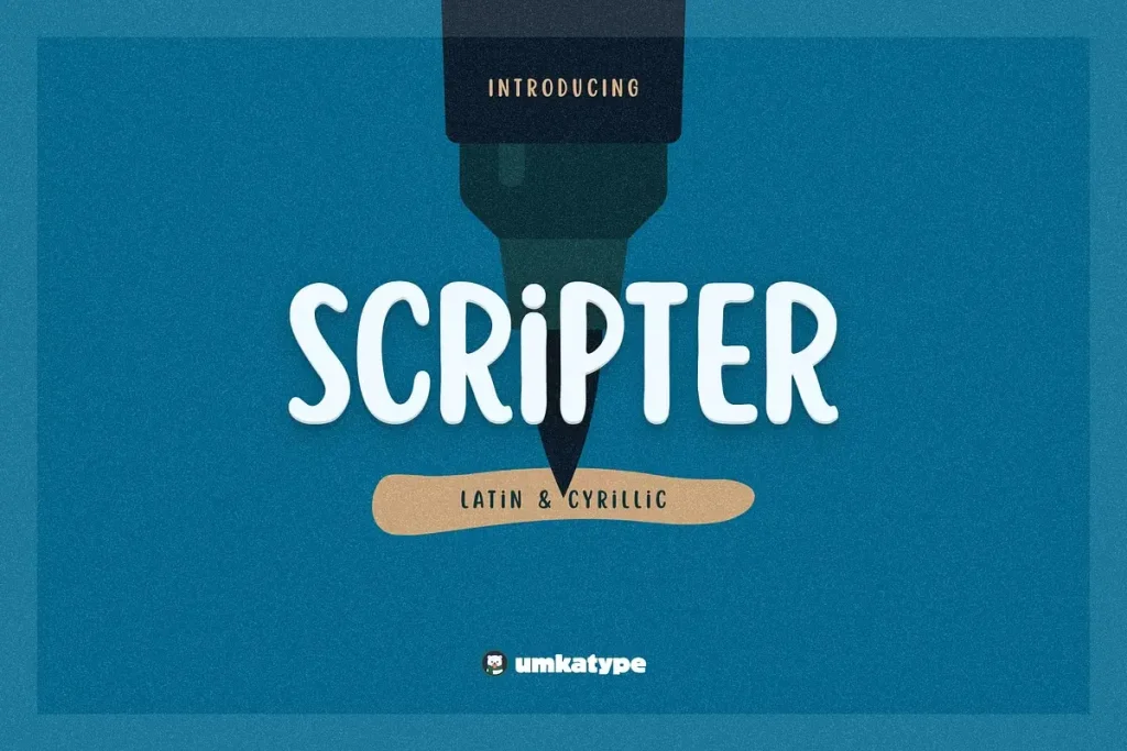

About Scripter Font
I first reached for Scripter Font while working on a small brand refresh for a local café. The client wanted something personal and relaxed, but not messy or childish. I needed a script that felt written by hand, yet still clean enough for menus and social posts.
What pulled me in was the balance between charm and control. The strokes have an easy flow, but the structure stays stable. As I tested it in mock-ups for Free Fonts Lab, I noticed how quickly it gave headlines a friendly tone without shouting for attention.
I decided to keep exploring it across different layouts, from logo sketches to quote graphics, to see where it shines and where it starts to struggle.
Font Style & Design Analysis
Scripter Font is a script typeface with a smooth, casual rhythm. The letters look like quick but confident handwriting, with gentle curves and soft loops. It sits between playful and grown-up, which makes it feel approachable. The stroke contrast is mild, so the texture stays even on screen and in print.
The designer is unknown, at least from the sources I could find while testing this font family. That makes detailed background notes tricky, but the intention is clear from the drawing. Someone aimed for a modern script that stays flexible rather than highly decorative. It feels designed more for everyday branding than for fancy calligraphy pieces.
The letterforms have open counters and mostly simple terminals, which helps readability. Lowercase connections are smooth, with only a few tighter joins around letters like “r”, “s”, and “t”. Spacing is fairly tight by default, so I often loosen the tracking a bit for small text. The mood is friendly and informal, but not silly. This script font handles short phrases and names well, though long paragraphs start to feel heavy and tiring to read.
Where Can You Use Scripter Font?
I found Scripter Font most useful in branding for small businesses, like cafés, boutiques, and craft shops. It works nicely for wordmarks, sub-logos, and packaging titles. At larger sizes, the curves show well and the strokes feel warm. It also suits social media graphics where you need a human touch.
In layouts, I usually pair it with a clean sans-serif or light serif for body text. Using it for headings or short lines keeps the typography balanced. At medium sizes, like menu sections or poster subtitles, it remains readable if you give it enough line spacing. For very small text, the connected letterforms start to merge, so I avoid it for legal lines or long captions.
This script font also fits invitation cards, greetings, and simple quote designs aimed at a broad audience. It feels friendly enough for lifestyle brands, but still calm enough for more mature customers. When I need a relaxed handwritten flavour without full calligraphy drama, this is a safe option to try in the concept stage.
Font License
The licence for Scripter Font can vary depending on where you download it. Always check the official source for current terms before using it. Make sure you confirm whether personal, commercial, or client projects are allowed, and keep a copy of the licence for your records.
For me, Scripter Font works best as a friendly accent in branding and short text, not as a full workhorse, but it earns a place in my concept toolkit.


Leave a Reply