

About Selena Font
I came across the Selena Font while searching for a soft, romantic script for a small wedding brand. I needed something elegant but still easy to read, especially for names and short phrases on invitations and menu cards. The first test lines looked promising, so I decided to explore it more.
What kept me interested was how calm and graceful the strokes felt. Many script fonts try to look fancy and end up messy, but this one stayed quite controlled. I used it in mockups for Free Fonts Lab and noticed it sat nicely beside simple serif and sans-serif text. That mix made the visual identity feel gentle, not loud.
Font Style & Design Analysis
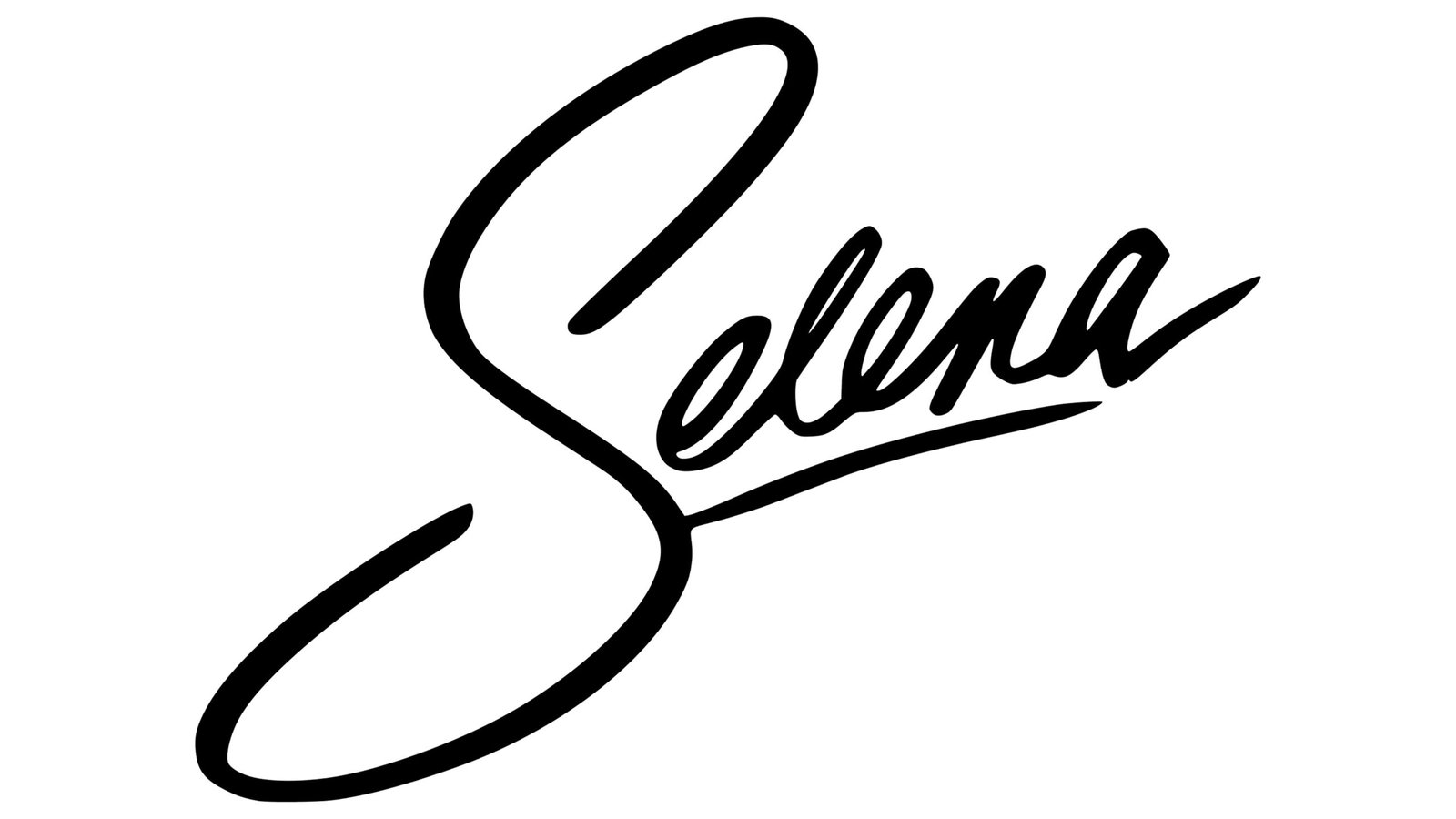
Selena Font is a script typeface with flowing, connected letterforms and a clear calligraphic influence. The strokes feel smooth and slightly slanted, giving a natural handwritten rhythm without looking too casual. It leans more towards romantic and feminine energy, which shows in the curves, loops, and soft terminals across the font family.
The designer is unknown, which always makes me look more closely at the craft instead of the name behind it. I checked how consistent the shapes were across uppercase and lowercase. The overall typography feels considered, even if it is not as polished as some premium scripts. Still, the design direction is clear and focused on graceful display use.
The letterforms have medium contrast between thick and thin strokes, which helps the script stay readable at medium sizes. Spacing is slightly tight, as you expect with many script fonts, but it rarely collides in normal text. The rhythm works best for short words, signatures, and headings. Long paragraphs in this script feel heavy, so I would avoid it for body copy. Its strength is mood-setting, not long reading.
Where Can You Use Selena Font?
I find Selena Font most useful in branding pieces that need a soft, personal voice. Think wedding stationery, save-the-date cards, boutique logos, and beauty packaging. At larger sizes, the script category details really shine, especially the curves and loops. It pairs well with a clean serif or sans-serif for balance and structure.
On screens, it performs nicely for headings, banners, and social media graphics where you keep the text short. On mobile, I would avoid very small sizes, because thin strokes can start to blur. For quotes, product names, or highlight words, it adds a gentle handwritten feel without becoming wild or messy. That makes it suitable for lifestyle, fashion, and cosmetic brands.
For print, I tested it on mockups of cards and labels. At medium sizes, the script letterforms stayed readable, especially with enough spacing around the words. I would not use it in all caps for long text, as the shapes begin to lose their flow. Instead, I prefer capital initials with lowercase words, supported by a neutral companion typeface.
Font License
The licensing for Selena Font can vary by source, so I never assume it is free for every use. Before using it in client work or commercial branding, I always check the official licence details. Make sure you confirm what is allowed for personal projects, print runs, apps, or logo work.
For me, Selena Font is a careful choice for soft, emotional projects where a gentle script touch can carry the message without shouting.


Leave a Reply