

About Silka Font
I ran into Silka Font while working on a clean tech brand that needed calm, modern typography. Their team wanted something neutral but not cold, and I needed a typeface that could hold a full identity system without drawing too much attention to itself.
As I tested options for Free Fonts Lab, this font kept standing out in long text and tight grids. It looked practical on screen, yet still had a gentle character in the curves. That balance made me curious enough to use it in mockups, presentations, and a few real pitch decks.
Font Style & Design Analysis
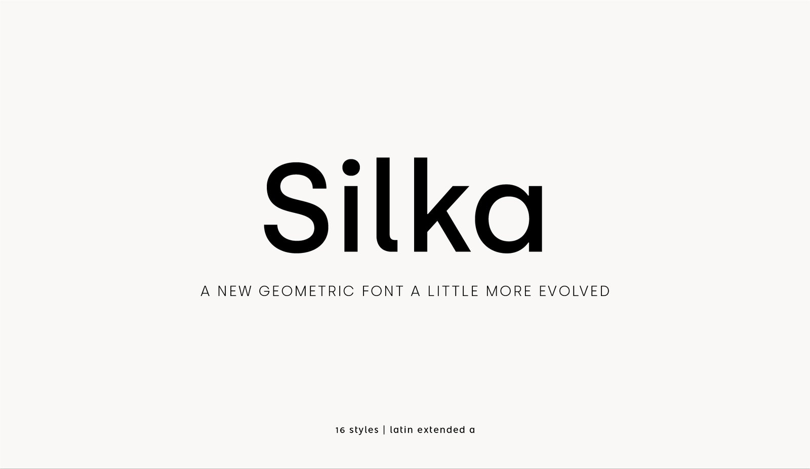
Silka Font is a geometric sans-serif with a soft, almost human touch. The skeleton feels clean and built on simple forms, but the corners and curves avoid harsh, mechanical edges. The style sits somewhere between strict geometry and friendly minimalism, which makes it easy to drop into different design systems.
The font family comes from a contemporary type foundry with a clear focus on digital-first typography; the exact designer is sometimes listed differently across sources, so I treat it as designer unknown when documenting assets. What matters in use is that the shapes feel consistent and carefully drawn, especially at medium text sizes.
The letterforms stay open and airy, with rounded details that soften the geometric base. Spacing is fairly tight by default, but the rhythm still reads stable in paragraphs. In large headings, the bowls and straight stems give a confident, modern mood. In very small captions, some weights can feel a bit dense, so I tend to increase tracking slightly. As a sans-serif, its strengths are clarity, neutrality, and calm tone; its main limitation is that it can feel too restrained for highly expressive branding.
Where Can You Use Silka Font?
I found Silka Font especially strong in digital products, dashboards, and clean website layouts. It holds up well in UI labels, buttons, and navigation because the shapes remain simple and predictable. On high-resolution screens, the curves look smooth without any distracting quirks, which helps when you build complex interfaces.
In print, it works nicely for brochures, editorial systems, and simple brand guidelines. For headings, medium and bold weights give enough presence without shouting. For body text, I prefer the regular weight at slightly looser leading to keep paragraphs breathable. It handles multi-column grids, tables, and charts with steady alignment and good legibility.
For pairings, I often match this sans-serif with a warm serif for titles or pull quotes, or with a light script accent in lifestyle brands. When used alone, varying weight, size, and letterspacing can create a full visual hierarchy. I would use it for tech brands, education platforms, minimalist portfolios, and any project that needs a quiet, modern voice instead of a loud statement.
Font License
Licensing for Silka Font can differ between personal and commercial use, and sometimes between desktop, web, and app embedding. I always recommend checking the official source or foundry for the most current licence terms before using it in client work or large-scale projects.
My honest takeaway as Ayan Farabi: I reach for Silka when I need a dependable, modern base that supports the design, rather than competes with it.


Leave a Reply