
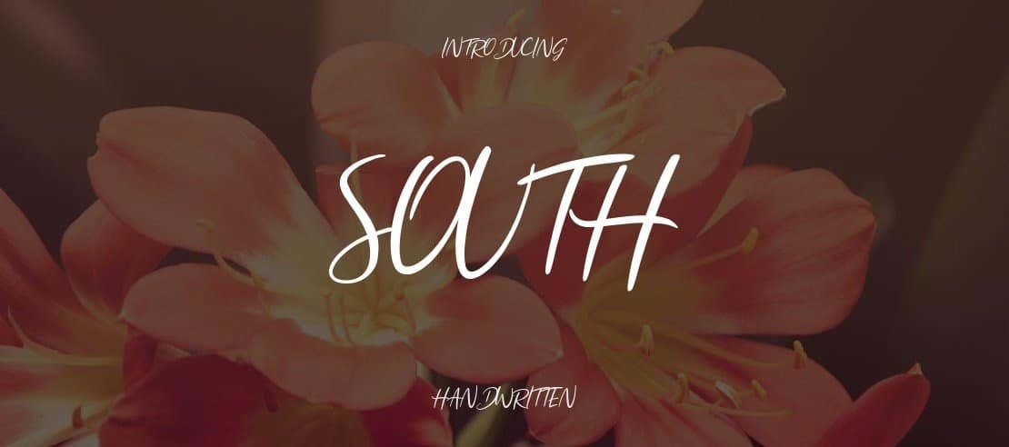

About South Font
I came across South Font while browsing for a loose, natural handwriting style for a small brand refresh. The project needed something relaxed, but not childish. I wanted a typeface that felt like a quick note from a friend, yet still stayed readable in simple layouts.
South Font caught my eye because its strokes look unpolished in a good way. It feels casual, but not messy. I decided to test it on mood boards and social posts for a lifestyle client, then wrote this review for Free Fonts Lab to share how it behaved in real work.
Font Style & Design Analysis
South Font is a handwritten typeface with an easy, loose drawing style. The letters lean slightly and have a relaxed, pen-on-paper feel. Strokes change thickness in a gentle way, so the font style looks lively rather than stiff. It gives the sense of someone writing quickly, but still trying to stay neat.
The designer is unknown, at least from the sources I checked. That can make it harder to trace its design story or compare it directly to a clear font family from a known foundry. Still, the intention feels obvious: a casual handwritten look that suits modern, friendly visual identity work.
The letterforms have open counters and rounded curves, which help with legibility at medium sizes. Spacing is a bit tight in some pairs, especially between certain lowercase letters, so I sometimes adjusted tracking by a few points. The rhythm reads playful and human, not formal. It works well for headings and short text, but longer paragraphs can feel slightly busy.
Where Can You Use South Font?
South Font works nicely in projects that need a personal, approachable voice. I had good results on social media graphics, packaging mockups, and quote-style posts. At larger sizes, its handwritten character really shows, and the small quirks in the strokes become a strength, adding charm without feeling forced.
At smaller sizes, like dense body copy, the same quirks can reduce clarity. I would avoid using it for long paragraphs or detailed UI text. Instead, I pair it with a clean sans-serif for the main reading content. South Font then steps in for headings, callouts, and small notes that guide the eye.
This handwritten font can work well for lifestyle brands, stationery, small café menus, and children-focused graphics. It suits audiences who respond to friendly, informal typography. When I plan layouts, I keep its energy as an accent, not the full structure. Used in measured doses, it brings warmth and personality to the visual identity.
Font License
Before using South Font in client or commercial projects, I always check the current licence from the original source. Terms can change over time, and personal use does not always cover business work. It is worth reading the full licence text carefully to stay safe and respect the designer.
For me, South Font is a handy option when I want handwriting that feels relaxed but still considered. I use it best in short bursts, where its personality has room to breathe.


Leave a Reply