
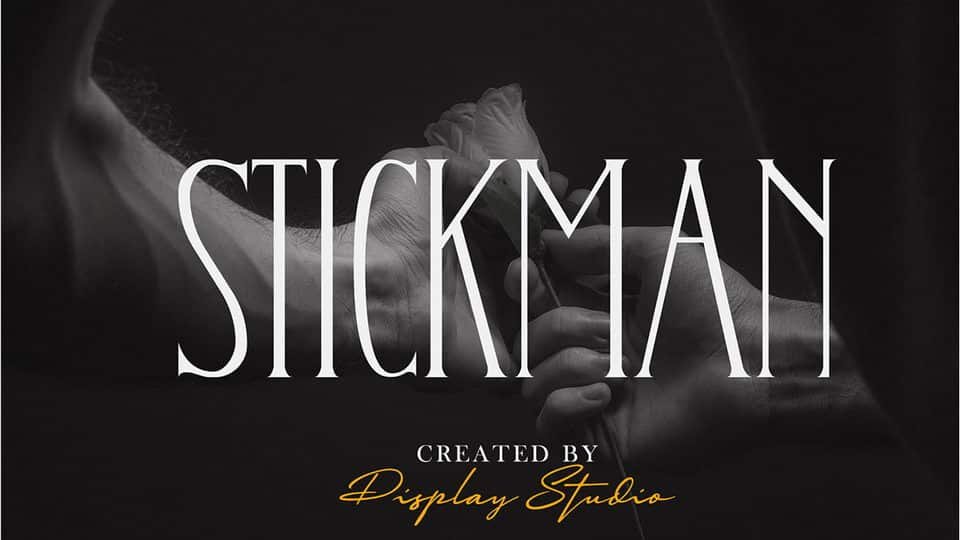

About Stickman Font
I first tried Stickman Font while working on a small print booklet for an art workshop. I needed a serif typeface that felt playful but still readable in short text. The name sounded casual, but the design felt more considered than I expected, so I decided to give it a proper test.
As I used it through a few page layouts, I noticed how quickly it set a tone. It added a light, friendly energy without turning the project into a joke. That balance between fun and structure made me curious enough to explore it further and share my thoughts here on Free Fonts Lab.
Font Style & Design Analysis
Stickman Font is a serif typeface with a simple, almost sketch-like charm. The strokes feel clean but a bit loose, as if drawn with a steady pen rather than built from strict geometry. The serifs are modest and slightly softened, which keeps the font style from looking stiff or overly formal on the page.
The designer is unknown, at least from what I could find, so I had to judge it only by use rather than reputation. Even so, the font family shows a clear idea: casual serif shapes that still follow basic typographic rules. It does not try to show off; instead, it stays approachable and consistent across different words and lines.
The letterforms have open counters and a relaxed rhythm, which helps with quick reading in short paragraphs. Spacing is on the loose side, giving text a bit of air, especially in titles and pull quotes. In my tests, it worked best at medium to large sizes; at very small sizes, the sketchy feeling can soften edges too much. Its strengths sit in headings, posters, and short copy where mood matters more than strict efficiency.
Where Can You Use Stickman Font?
In my own work, Stickman Font shined in creative and informal projects. It suits art workshops, children’s materials, craft brands, and relaxed editorial layouts. Because it is a serif, it still carries a hint of structure, which helps when you want friendly typography that does not feel childish or chaotic.
At larger sizes, such as posters, covers, and social graphics, the details of the letterforms stand out nicely. The slight wobble in strokes adds character without hurting legibility. At small text sizes, I would use it only for short sections, like captions or callouts, rather than full essays. For longer reading, a more traditional serif might pair better.
Speaking of pairing, I had good results matching Stickman Font with a clean sans-serif for body text. Let Stickman handle headings, subheads, and highlighted phrases, while the sans-serif keeps paragraphs calm and easy to scan. This mix creates a clear visual identity that feels warm, creative, and still practical for everyday readers.
Font License
The licence terms for Stickman Font may vary depending on the source where you download it. You should never assume it is free for commercial work, even if it appears as a free download. Always read the official licence carefully and confirm whether personal, client, or commercial projects are allowed. My own takeaway: use it thoughtfully, and test it in context before committing it to a full identity system.


Leave a Reply