
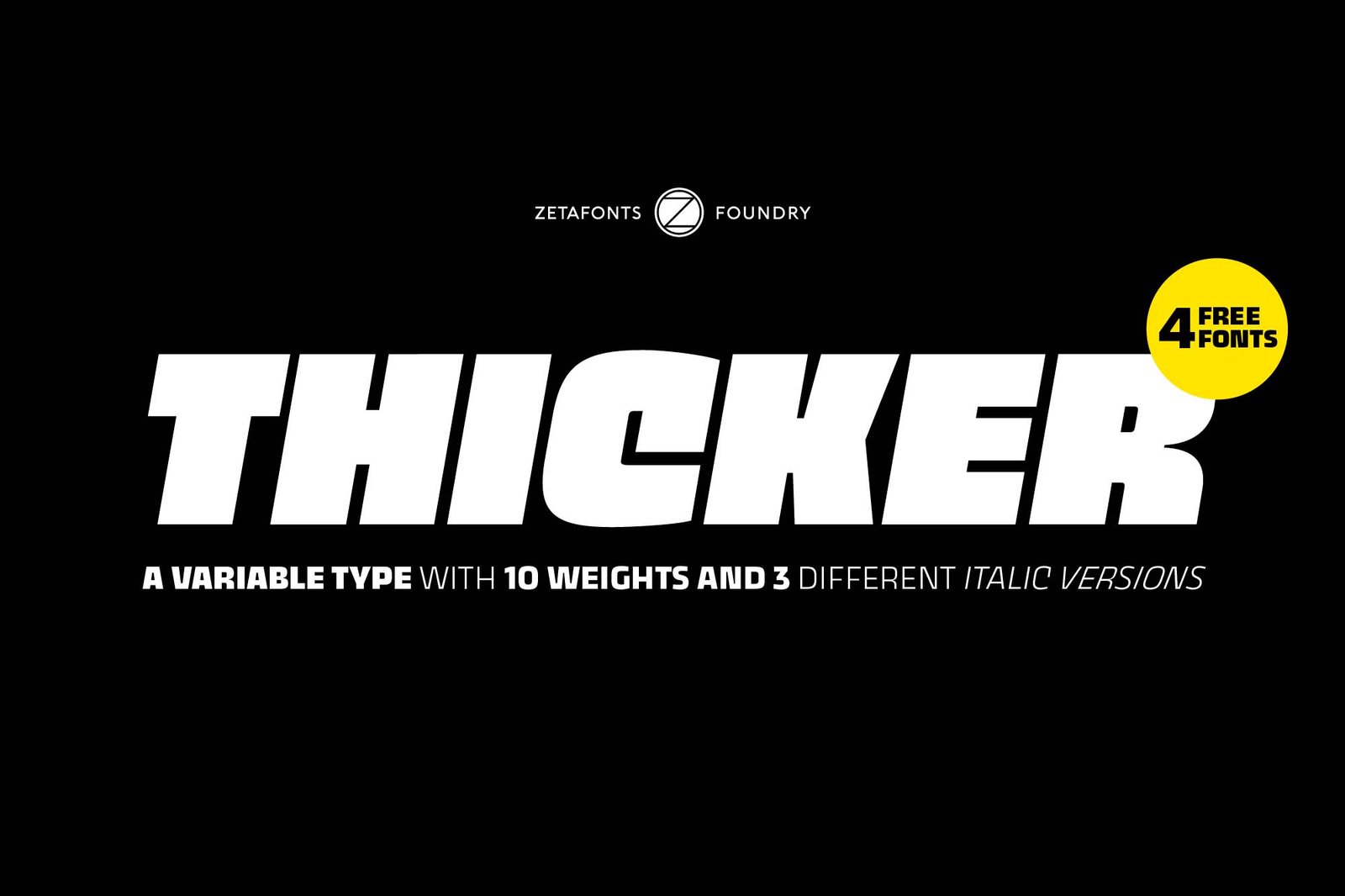

About Thicker Font
I first tried Thicker Font while working on a bold poster for a small local event. I needed a clean typeface that felt strong, but not harsh or aggressive. The name made me curious, so I downloaded it and started testing it in different layout ideas.
What held my attention was how simple the shapes looked on screen, yet they still carried weight and presence. I used it in several mock-ups for Free Fonts Lab, mainly for headings and short text blocks. I wanted to see how it behaved in real layouts, not just in a sample image.
Font Style & Design Analysis
Thicker Font is a sans-serif typeface with chunky strokes and a compact feel. The overall font style leans towards modern display work, with wide forms and low contrast. It feels straightforward and sturdy, which gives it a clear, confident voice in any visual identity or layout.
The designer is unknown, and that sometimes makes it harder to understand the original intent of the typeface. When I cannot trace the foundry or creator, I tend to test more carefully. I look for issues in spacing, consistency, and hinting before I even think about using it in a client project.
The letterforms are quite heavy, with rounded corners that soften the thick strokes a bit. Spacing is on the tighter side, especially in uppercase, so I often add tracking for headlines. The rhythm feels solid but not refined enough for long reading text. As a sans-serif font family, it works well for impact, yet it can feel clumsy in dense paragraphs.
Where Can You Use Thicker Font?
I see Thicker Font working best in posters, banners, and social media graphics where you want bold text. At large sizes, the heavy shapes look clear and stable, and the chunky letterforms grab attention quickly. On screens, it holds up well for titles and call-outs.
At smaller sizes, the weight becomes a problem. Counters close up, and words start to feel like dark blocks. I would not use it for body copy, captions, or UI elements. Instead, I pair it with a lighter, cleaner sans-serif font style for longer text, so the layout stays readable and calm.
For branding, I can imagine it in youth-focused projects, streetwear, gaming, or bold food packaging. It suits audiences that like strong, simple typography with a friendly edge. When I build a visual identity around it, I keep plenty of white space and use short words and short lines, so the thickness does not overwhelm the design.
Font License
The licence details for Thicker Font can change depending on the source you use. I always check the official download page to confirm what is allowed for personal and commercial projects. Before using it in a paid client job, make sure you read the current licence text carefully.
My own takeaway as Ayan Farabi: I treat Thicker Font as a strong display tool, useful when I need weight and clarity, but I keep it away from long reading text and always test it in real layouts before committing.


Leave a Reply