
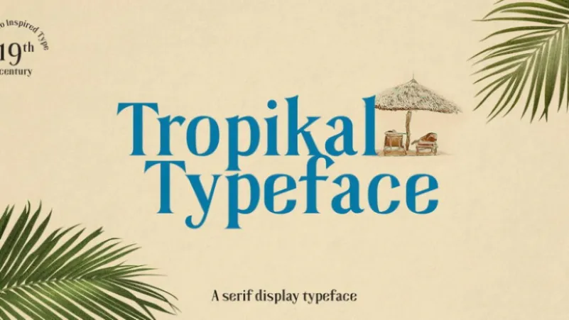

About Tropikal Font
I came across Tropikal Font while working on a small brand refresh for a café with a relaxed island theme. I needed a serif that felt sunny and calm, but not childish or loud. This typeface caught my eye because it looked elegant, yet still playful enough for friendly branding.
I decided to test it in logo sketches, menu headers, and simple posters. During that process, I wrote notes for Free Fonts Lab, focusing on how it behaved in real layouts. My first impression was that it balances structure and charm in a way that suits modern, travel-inspired design.
Font Style & Design Analysis
Tropikal Font is a serif typeface with a clear, relaxed, and slightly nostalgic direction. The letterforms feel rooted in classic book typography, but there is a gentle tropical twist in the curves and proportions. It does not shout; it gives a soft, steady voice that still feels distinctive in headings.
The designer is not clearly credited, so for now I will note the creator as designer unknown. That said, the font feels carefully drawn, with consistent weight and a clear idea behind its style. It seems built for branding and editorial work, rather than purely decorative use.
The letterforms have tall, open counters and smooth, modest serifs that keep words readable even at mid sizes. Spacing is slightly loose, which helps in titles but may need small tracking tweaks in tight layouts. The rhythm feels calm and even, giving text a relaxed, coastal mood. Its strength lies in display and short copy; for dense body text, the same soft character can feel a bit too airy.
Where Can You Use Tropikal Font?
In my tests, Tropikal Font worked nicely for brand identities related to travel, cafés, skincare, and lifestyle products. It gives a gentle, warm presence that suits businesses wanting a friendly, modern serif voice. On posters and packaging, it brings just enough personality without becoming a themed novelty font.
At large sizes, the serif details and curves really shine, especially in logos, page titles, and hero text on simple layouts. I would pair it with a clean sans-serif for body copy, keeping Tropikal Font for headings, pull quotes, and short taglines. This balance keeps the design fresh and avoids visual heaviness.
At smaller sizes, the typeface stays readable, but I would avoid very long paragraphs in this serif if the text is tiny. It feels better for menus, short descriptions, and editorial subheads than full books. For audiences, it works well for young adults and design-aware brands that want a soft, natural look instead of a stiff, traditional serif.
Font License
The licence terms for Tropikal Font can change depending on where you download it and how you plan to use it. Always check the official source to confirm what is allowed for personal, commercial, desktop, or web use. I never start client work with this font before reading the current licence details carefully.
My honest takeaway: I reach for this serif when I want a breezy, confident mood without losing clarity, and it has earned a place in my short list for relaxed, modern branding projects.


Leave a Reply